
Boldin
Boldin is a retirement and financial planning platform that empowers users to make smarter decisions about their savings, investments, and income strategies.
role
design lead
squad
Marketing
team
Marketing director,
growth markeing manager,
head of design
Evolving the Boldin brand
01. Introduction
In 2024, NewRetirement took a bold step forward rebranding to Boldin, a name and identity that better reflected the company’s mission: helping people live their financial lives with confidence.
As part of the design team, I helped shape the rebrand rollout, brand system, and marketing expressions that would unify product, marketing, and enterprise experiences under one cohesive vision.

Legacy logo

New logo


Legacy logo
New logo
02. Rebrand and manifesto
The rebrand wasn’t just a new name — it was a philosophical shift.
The original name tied the company to one stage of life. Boldin was created to represent a lifelong journey of financial confidence, empowering people to be bold in every decision they make.

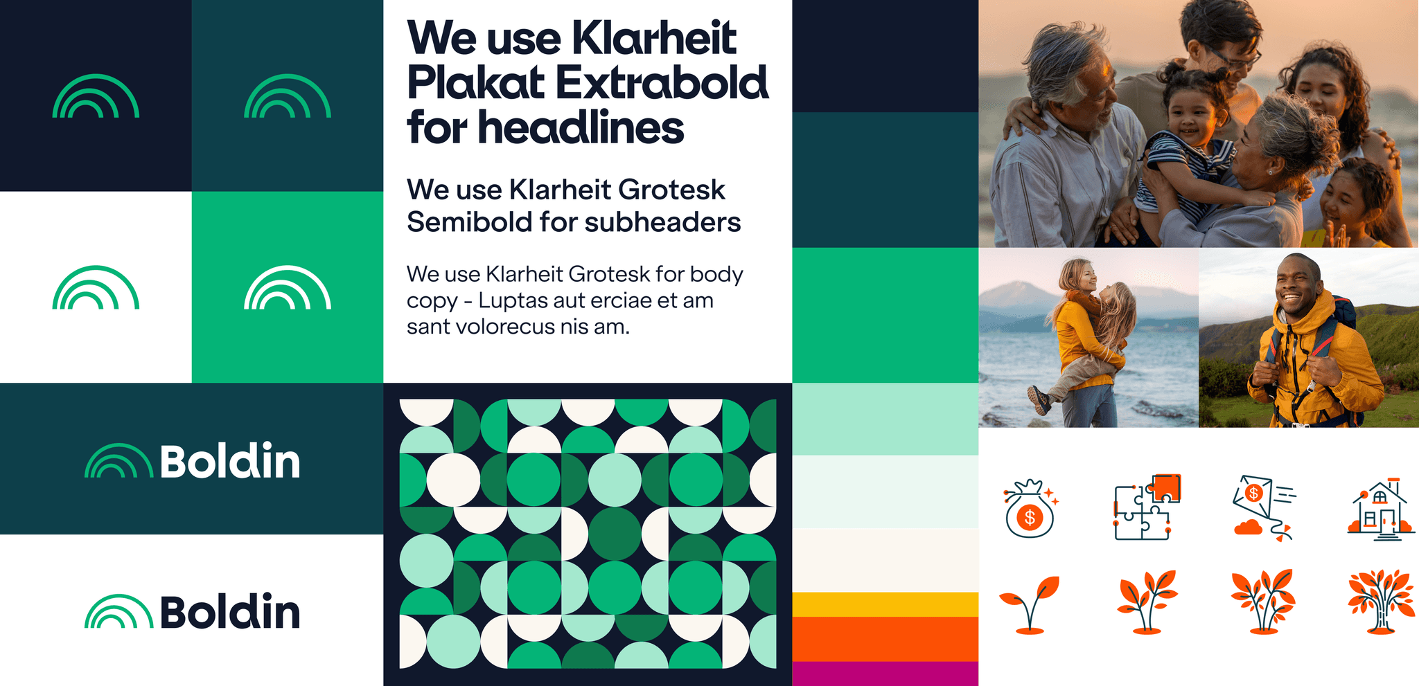
03. Brand system and assets
Our team built a comprehensive brand system to ensure consistency across every touchpoint — from advisor tools and dashboards to enterprise partner sites.
Logo & Mark: The rising sun motif symbolized illumination, forward motion, and continuous growth.
Typography: Klarheit Plakat and Klarheit Grotesk formed the typographic backbone, balancing clarity with strength.
Color: A refined palette of Teal, Ink, and Bright Green conveyed trust and optimism, complemented by warm neutrals and expressive accents.
Patterns & Iconography: Modular patterns and hand-crafted icons reinforced brand recognizability across product and marketing.
Voice & Tone: The verbal identity embraced optimism, empowerment, and trust — plain language that replaced jargon with approachability.
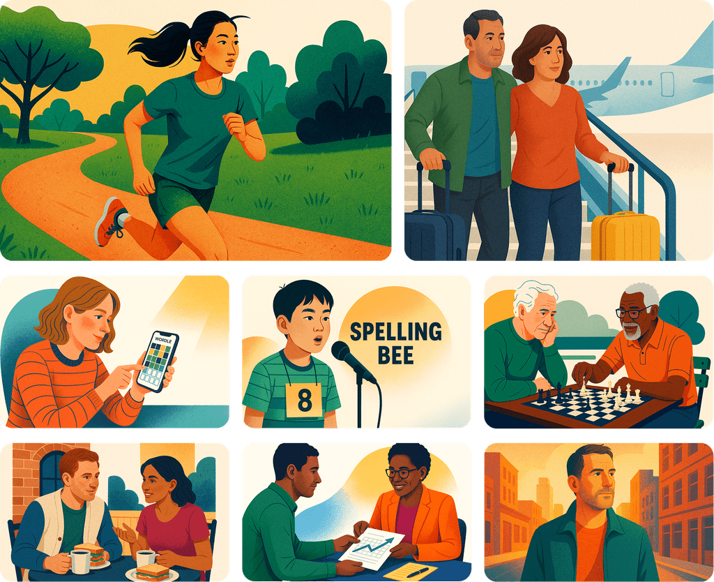
04. Illustration and AI
To humanize complex financial topics, we established a new illustration style warm, aspirational, and grounded in real life.
We combined hand-crafted illustrations with AI-assisted concepting to product a style that fit our new aesthetic, accelerating creative exploration while maintaining brand authenticity.
Each illustration was built around narrative themes like “Confidence, not confusion” and “A clear picture of where you stand today” helping transform financial planning from intimidating to empowering.
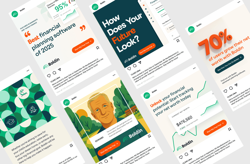
05. Paid social and marketing expression
We extended the new identity across paid social, podcasts, and marketing campaigns translating brand principles into motion and storytelling.
Campaigns centered on financial empowerment and trust, using bold color, expressive typography, and optimistic messaging to stand out in a traditionally sterile category.
On platforms like Facebook, LinkedIn and Reddit, Boldin’s social creative became a showcase of clarity, warmth, and confidence — turning complex financial ideas into approachable, human stories.
03. Brand system and assets
Our team built a comprehensive brand system to ensure consistency across every touchpoint — from advisor tools and dashboards to enterprise partner sites.
Logo & Mark: The rising sun motif symbolized illumination, forward motion, and continuous growth.
Typography: Klarheit Plakat and Klarheit Grotesk formed the typographic backbone, balancing clarity with strength.
Color: A refined palette of Teal, Ink, and Bright Green conveyed trust and optimism, complemented by warm neutrals and expressive accents.
Patterns & Iconography: Modular patterns and hand-crafted icons reinforced brand recognizability across product and marketing.
Voice & Tone: The verbal identity embraced optimism, empowerment, and trust — plain language that replaced jargon with approachability.
04. Illustration and AI
To humanize complex financial topics, we established a new illustration style warm, aspirational, and grounded in real life.
We combined hand-crafted illustrations with AI-assisted concepting to product a style that fit our new aesthetic, accelerating creative exploration while maintaining brand authenticity.
Each illustration was built around narrative themes like “Confidence, not confusion” and “A clear picture of where you stand today” helping transform financial planning from intimidating to empowering.
05. Paid social and marketing expression
We extended the new identity across paid social, podcasts, and marketing campaigns translating brand principles into motion and storytelling.
Campaigns centered on financial empowerment and trust, using bold color, expressive typography, and optimistic messaging to stand out in a traditionally sterile category.
On platforms like Facebook, LinkedIn and Reddit, Boldin’s social creative became a showcase of clarity, warmth, and confidence — turning complex financial ideas into approachable, human stories.
" height="2.1187359513420594px" id="P5kIJB7Ko" transform="translate(4.268 0)" width="11.73219480873486px"/><path d="M 2.13 11.637 L 0 11.637 L 0 0 L 2.13 0 Z" fill="rgb(15, 14, 14)" height="11.636652122173734px" id="xBplekXaY" transform="translate(13.87 0)" width="2.1296344887445002px"/><path d="M 1.509 14.942 L 0 13.447 L 13.563 0 L 15.073 1.496 Z" fill="rgb(15, 14, 14)" height="14.94221869628454px" id="DEz5S9WYM" transform="translate(0 1.058)" width="15.072818848944806px"/></g></svg>)
Boldin
Boldin is a retirement and financial planning platform that empowers users to make smarter decisions about their savings, investments, and income strategies.
Product Design
Design System
Branding
role
design lead
squad
Marketing
team
Marketing director,
growth markeing manager,
head of design
Evolving the Boldin brand
01. Introduction
In 2024, NewRetirement took a bold step forward rebranding to Boldin, a name and identity that better reflected the company’s mission: helping people live their financial lives with confidence.
As part of the design team, I helped shape the rebrand rollout, brand system, and marketing expressions that would unify product, marketing, and enterprise experiences under one cohesive vision.
Legacy logo
New logo
02. Rebrand and manifesto
The rebrand wasn’t just a new name — it was a philosophical shift.
The original name tied the company to one stage of life. Boldin was created to represent a lifelong journey of financial confidence, empowering people to be bold in every decision they make.
03. Brand system and assets
Our team built a comprehensive brand system to ensure consistency across every touchpoint — from advisor tools and dashboards to enterprise partner sites.
Logo & Mark: The rising sun motif symbolized illumination, forward motion, and continuous growth.
Typography: Klarheit Plakat and Klarheit Grotesk formed the typographic backbone, balancing clarity with strength.
Color: A refined palette of Teal, Ink, and Bright Green conveyed trust and optimism, complemented by warm neutrals and expressive accents.
Patterns & Iconography: Modular patterns and hand-crafted icons reinforced brand recognizability across product and marketing.
Voice & Tone: The verbal identity embraced optimism, empowerment, and trust — plain language that replaced jargon with approachability.
04. Illustration and AI
To humanize complex financial topics, we established a new illustration style warm, aspirational, and grounded in real life.
We combined hand-crafted illustrations with AI-assisted concepting to product a style that fit our new aesthetic, accelerating creative exploration while maintaining brand authenticity.
Each illustration was built around narrative themes like “Confidence, not confusion” and “A clear picture of where you stand today” helping transform financial planning from intimidating to empowering.
05. Paid social and marketing expression
We extended the new identity across paid social, podcasts, and marketing campaigns translating brand principles into motion and storytelling.
Campaigns centered on financial empowerment and trust, using bold color, expressive typography, and optimistic messaging to stand out in a traditionally sterile category.
On platforms like Facebook, LinkedIn and Reddit, Boldin’s social creative became a showcase of clarity, warmth, and confidence — turning complex financial ideas into approachable, human stories.