Role
Design Lead
Squad
Onboarding & Activations
Team
Product Manager, Engineering (FE & BE)
Research, Content Strategist, QA
BlockFi
BlockFi is a platform that redefines the future of banking where users can earn interest, borrow cash, and trade crypto from financial services providers.
01. The challenge
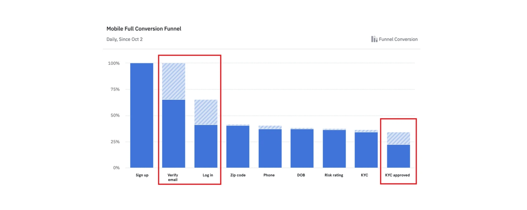
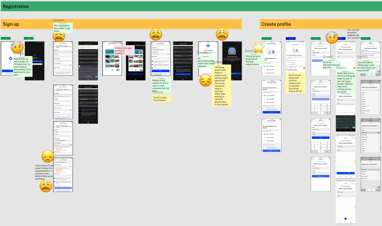
Clients today experience onboarding as “a necessary evil” to endure vs an experience that supports their investment goals. Users have to go through over 20 screens before they can even add money to the platform.
Business value: Increase # of clients who can immediately begin using our services.
• Drives 925K new accounts.
• Add $1.5M in revenue for newly acquired US clients.
• Save $76K on FTE headcount for manual KYC reviews by decreasing # of manual workflow events.
• Estimate 10%+ increase in conversion for US.
02. Metrics of success and impact
The redesign streamlined BlockFi's onboarding and verification flows, improving both user experience and operational efficiency.
Efficiency
Decrease number of pages and required fields.
KYC Success
Improve coverage and accuracy w/new data partners.
Conversion
10%+ increase in conversion for US customers.
Revenue
$1.5M in additional revenue for newly acquired US clients.
Operational
Headcount savings by removing manual kyc review.
03. User pain points
"Invasive as hell. They want to know everything about me before I could even browse the app. Felt like it was a cult leader or the DMV questioning me."
"I tried many times to complete my KYC but every time it got unsuccessful. Now it's telling me that it can't offer our services. What a useless app."
"I can't even get an account started. I tried 8 times to scan my Drivers License to prove that I am a legal human being...Moving on to another platform."
04. Approach — Experience deep dive
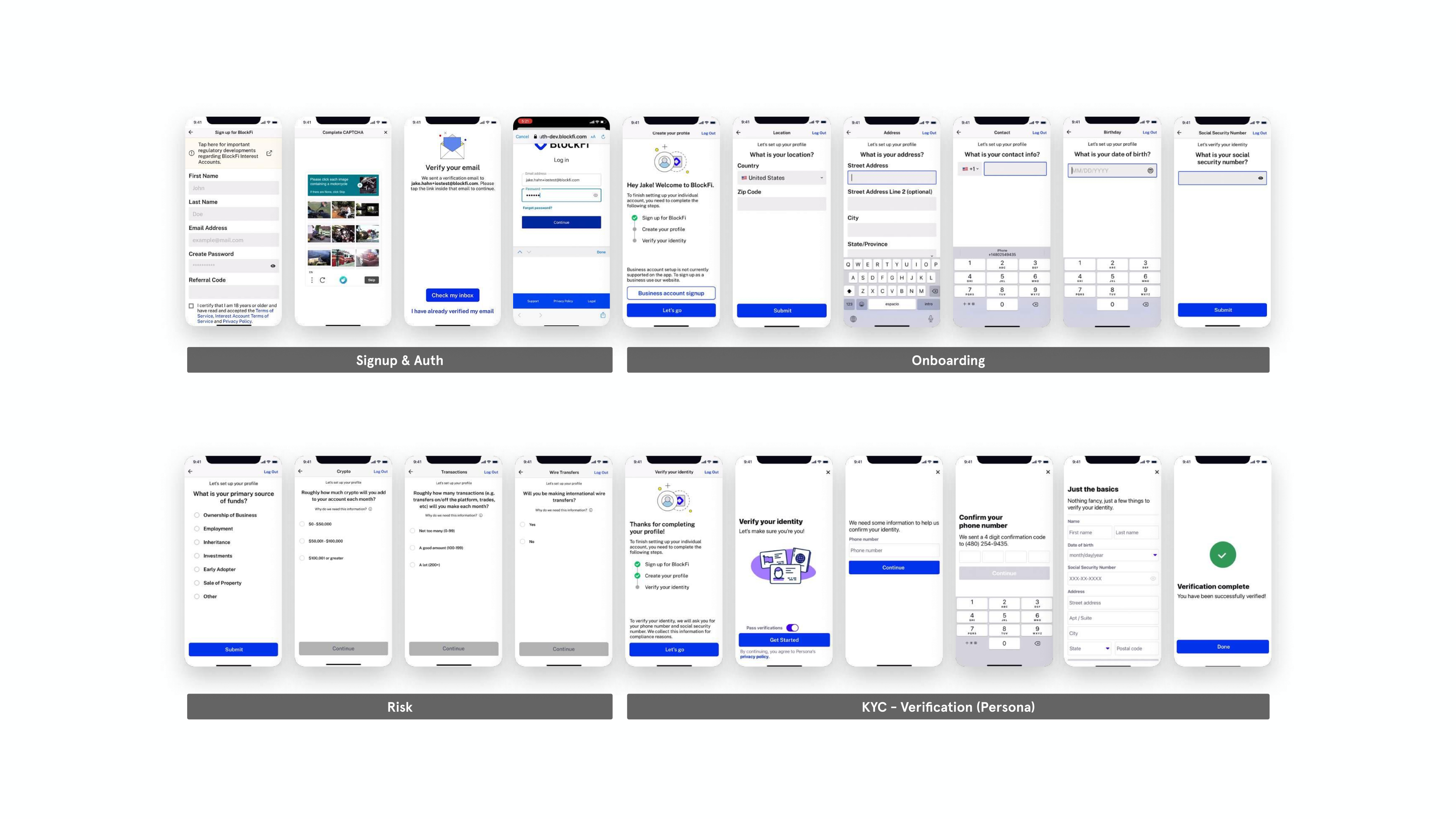
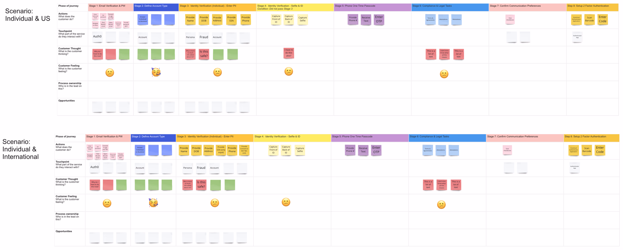
To overhaul the onboarding experience, I started by completing a full UX audit, scrutinizing every screen and taking note of potential opportunities for improvement.
I worked closely with product managers and engineers to develop a detailed map documenting all the different touchpoints in the customer journey.
05. Design concepts — Architecting a new future
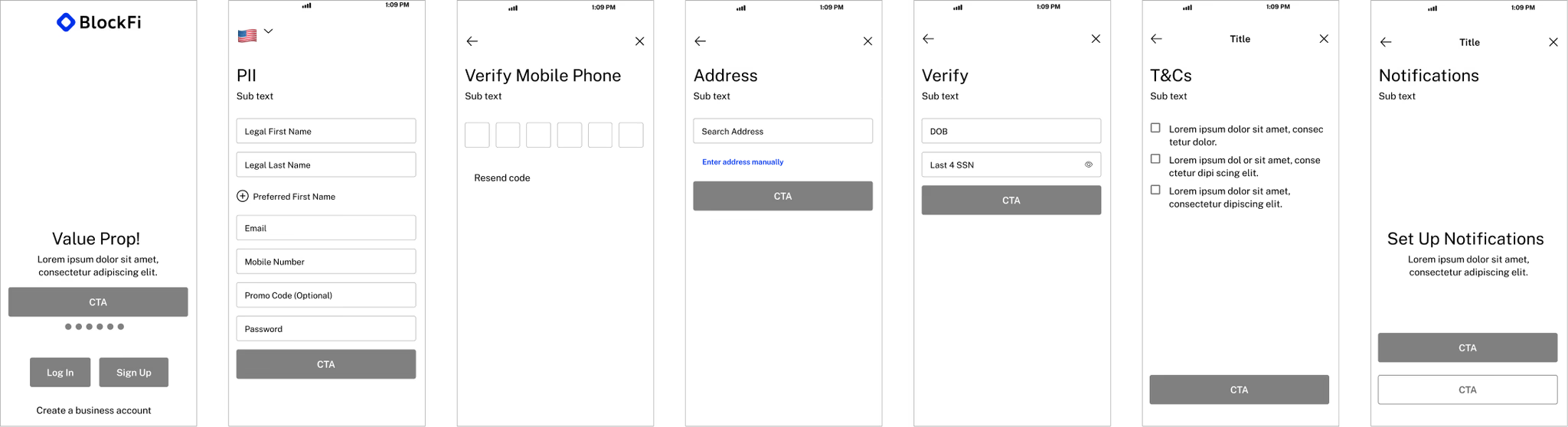
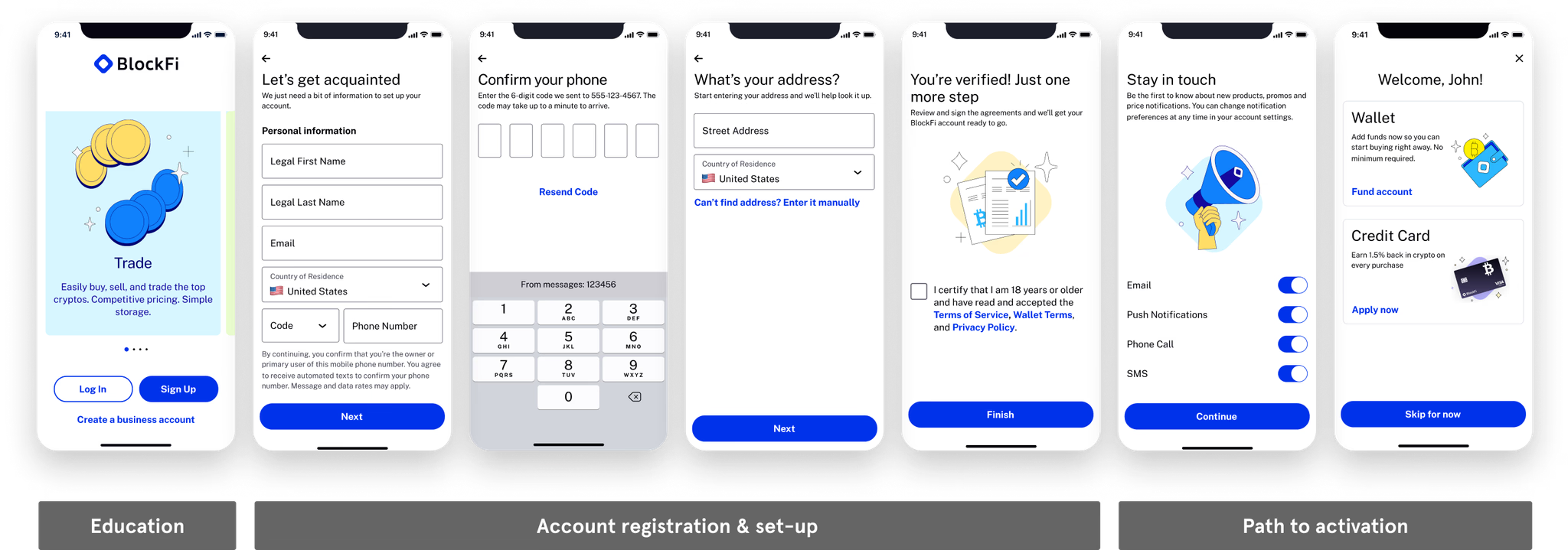
The happy path flow
The end result was an easy, quick, streamlined, personalized experience that set clients up for success by only asking for necessary info, using geo-location, and prefilled form fields. By overhauling onboarding for web and mobile applications, it enabled a 66% decrease in # of pages/form fields required.
- The splash screen is a moment to educate the user about value props.
- All major identifiers (PII) are on the initial page allowing more time for background verification.
- Offloading the address to its own page gives more breathing room.
- Consolidated T&Cs to own page for a final declaration of action.
- Buttons hug content, making them more reachable by thumb.
The unhappy path flow
By replacing Persona and integrating with 3rd party vendors, Telesign, Lexisnexis, and Sentilink, our verification process becomes more seamless with only 10% of users going through the unhappy path.

06. Insights from user testing
The experience was considered standard by most participants and the length of the flow was as expected.
No major usability or comprehension challenges were observed.
Since Trust was a point users called out during testing we added a Trust value prop to the carousel on the splash screen.
07. Parallel work streams
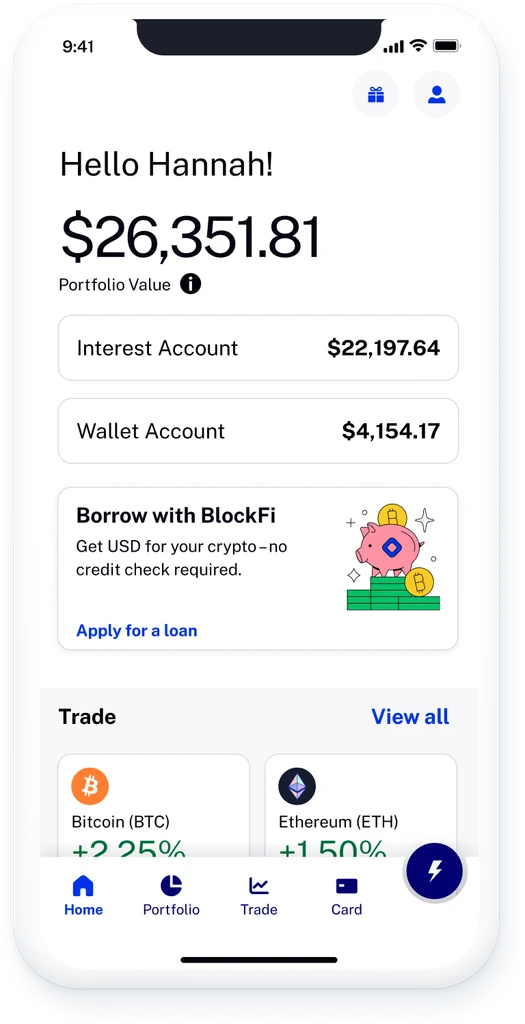
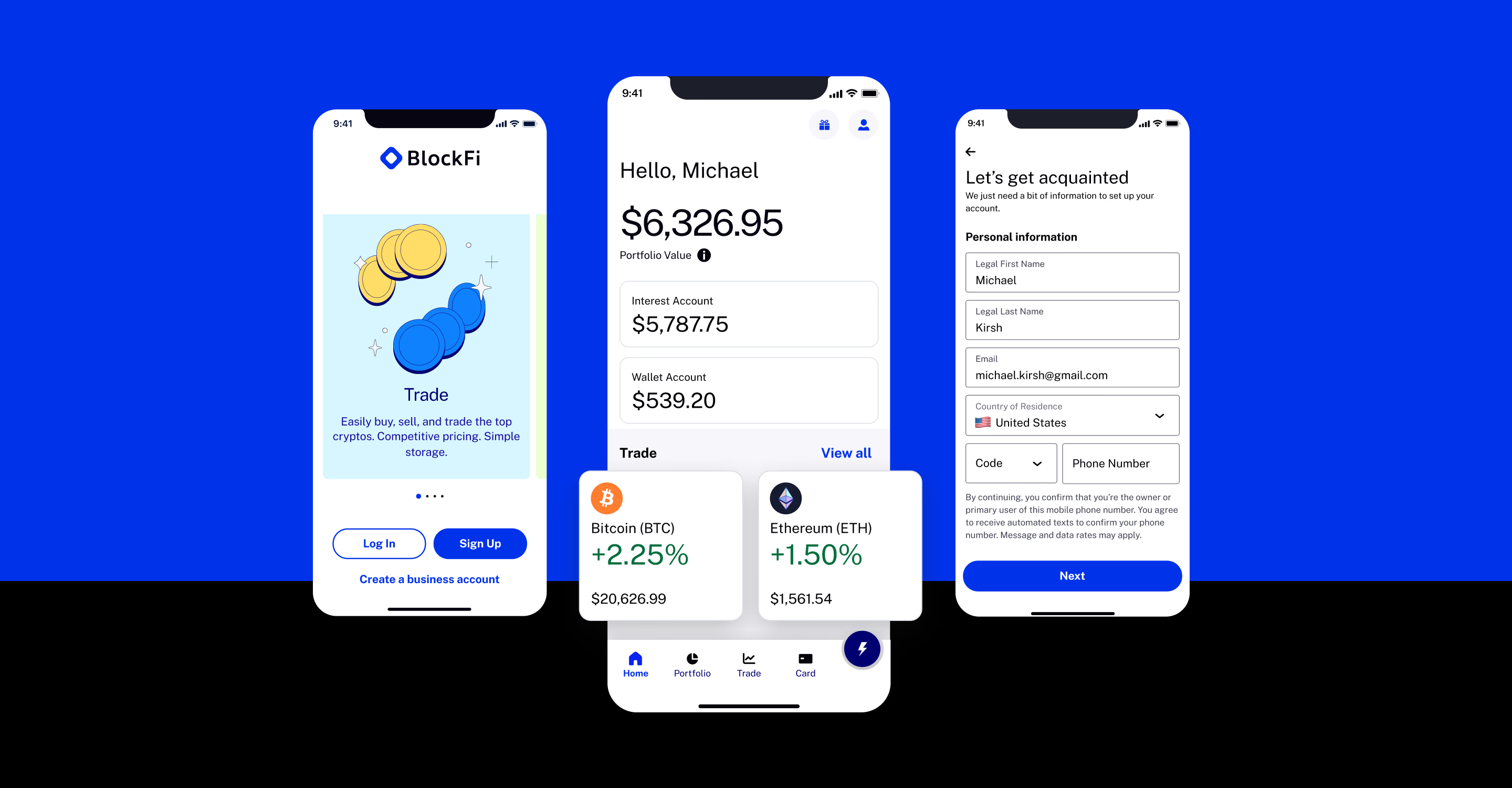
Home redesigned
Snapshot of a client's financial health with insights, quick actions, and tailored suggestions driving engagement.
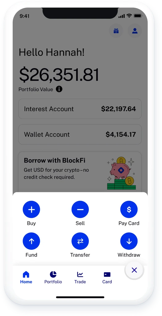
Quick Actions
Easy access to most relevant actions from anywhere in the app.
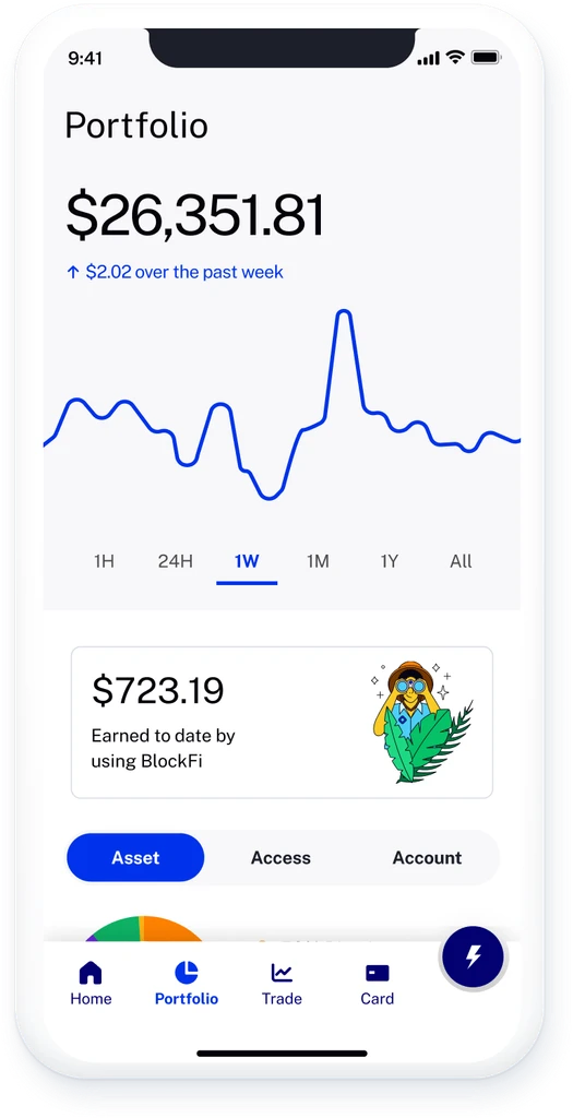
Portfolio
A clear overview of crypto assets, showing cross-portfolio data and detailed balances to guide key actions.
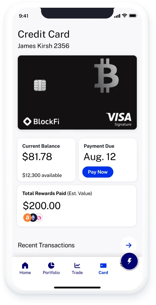
Credit Card
A clear, scannable snapshot of a client's credit card health with balance, payment due, and rewards tracking.