JetBlue
Born at JFK in 1999, JetBlue is now a global, award-winning travel company.
role
design lead
squad
Product & design
team
UX Director, ECD, 2 design leads, 2 squads UX/UI,
product manager, producers, account management,
product owners,
5 initiatives
Work produced at Big Spaceship
Redesigning JetBlue booking
To redesign the customer end-to-end booking experience online. Implement responsive web design and e-commerce best practices. Reinventing how customers purchase travel, by reducing the number of decisions.
Business value: To increase booking conversion.
The project was seen through the lens of 3 different personas.
Design decisions made were based on their motivations to help personalize the experience.
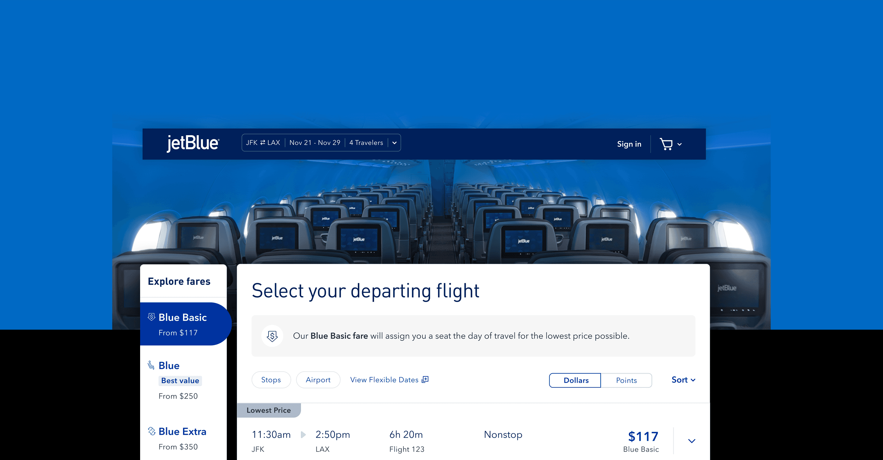
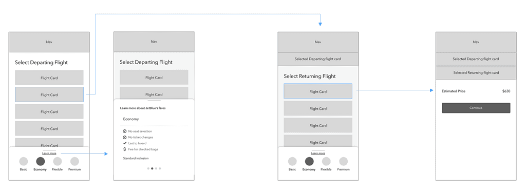
Flight results was optimized to include overall UX best practices. Through research and observing recorded videos of customers using the platform (Full story) we were able to get more insight and create a streamlined experience. Below is the legacy system and some highlighted painpoints.
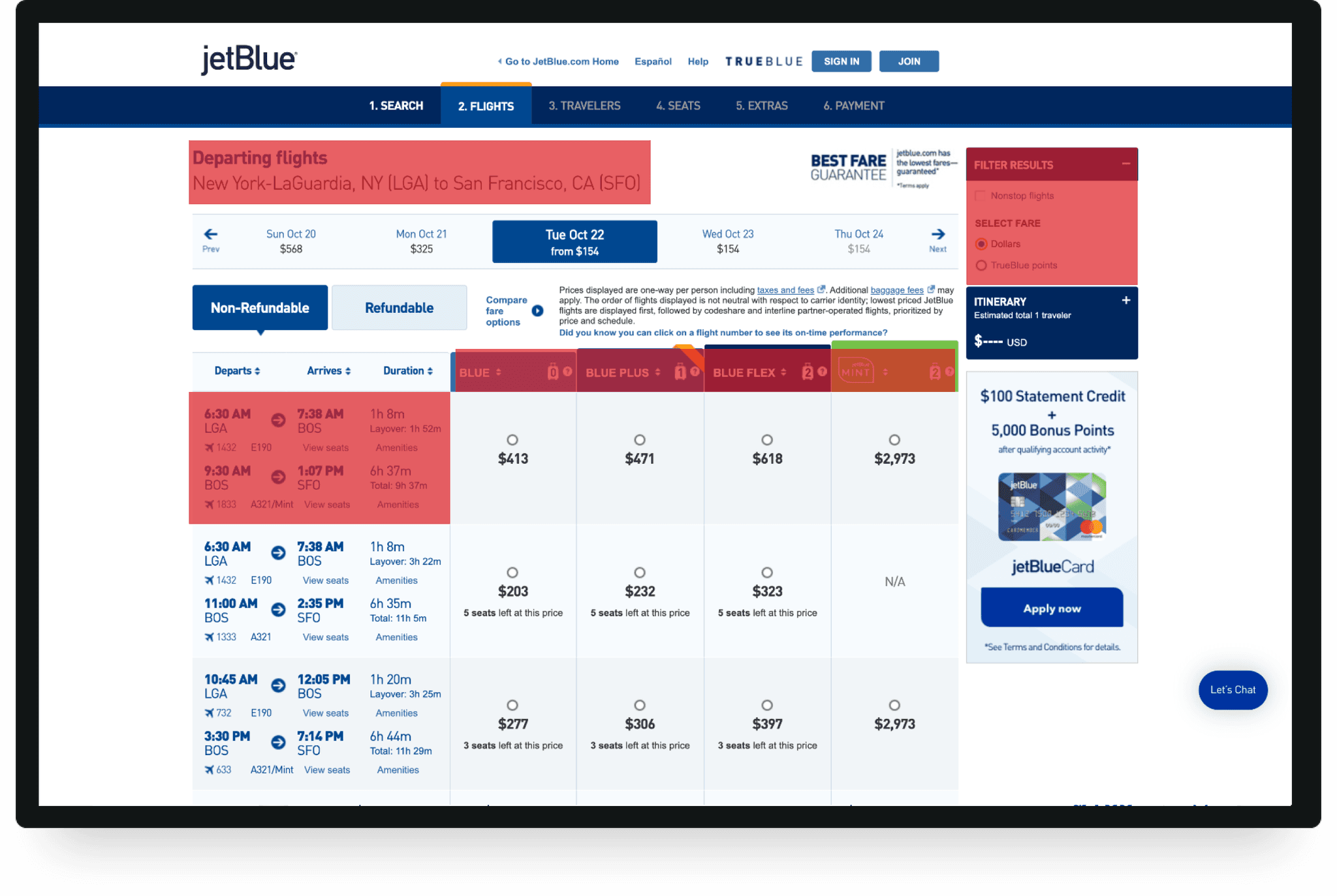
Classic accordion
Filter navigation
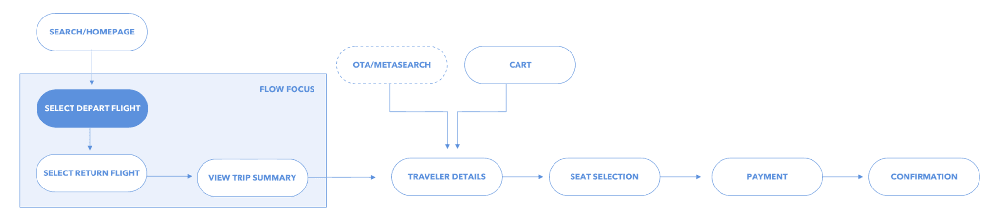
The top-level flow of how a user would funnel through the booking experience. A user can enter through the homepage or enter through an OTA (online travel agency, kayak, google flights)
12 qualitative and 50 quantitative mobile first tests were conducted to learn which of the two UX flows were the most usable for customers. We wanted to learn:
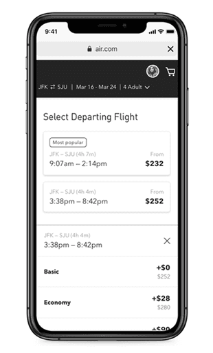
Can users easily distinguish between fare classes (Blue Basic, Blue, Blue Extra, Mint)?
Do the fare details clearly communicate benefits and inclusions?
Do users have enough context to choose the right fare confidently?
Key Findings:
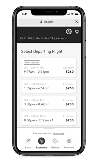
Filter navigation was the preferred design direction.
It allowed users to compare fares side by side and understand price differences quickly.
Users found it easier to stay oriented and explore fares in context.
Described as “clean,” “concise,” “easy to navigate,” and “efficient.
Filter navigation was the preferred UX design direction among users
• Offered the ability to compare price changes and understand what each fare class offered simultaneously
.
• Customers were able to learn more about each fare in context to how they navigated the screen, keeping customers oriented.
• Customers described it as “clean”, “concise”, “easy to navigate” and “efficient”.

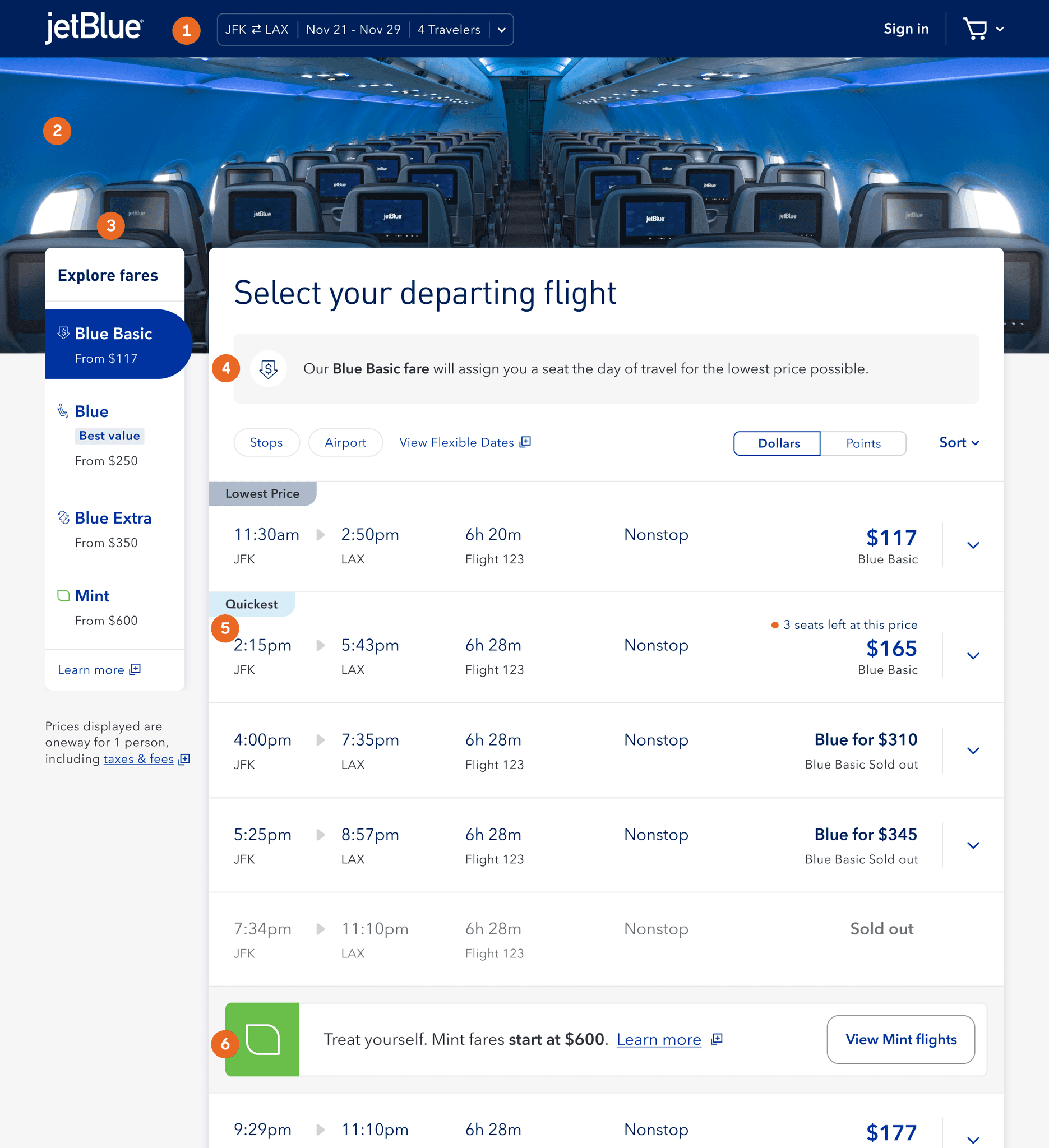
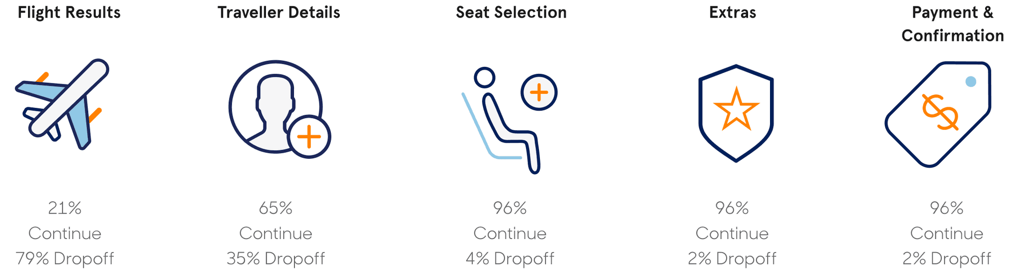
Flight Results UX improvements
Persistent Booker - Allows users to access and change flights quickly and easily within the flow
Hero Marquee - Visual interest / branded moment
Filter navigation (Filter panel) - From price / lowest price allows users to compare fares and choose what’s right for them
Value props for fare class - explanation allowing users to know what class they are on
Flight card details - We streamlined content and flight information easier to read and implemented, Flight tag recommendations
Fare upsells - Mint mode. A module to get users to upgrade and spend more!
This concept let users manually prioritize and rearrange withdrawal accounts via drag-and-drop. If users understand the value of an optimized withdrawal order, they’ll be more likely to upgrade or renew.
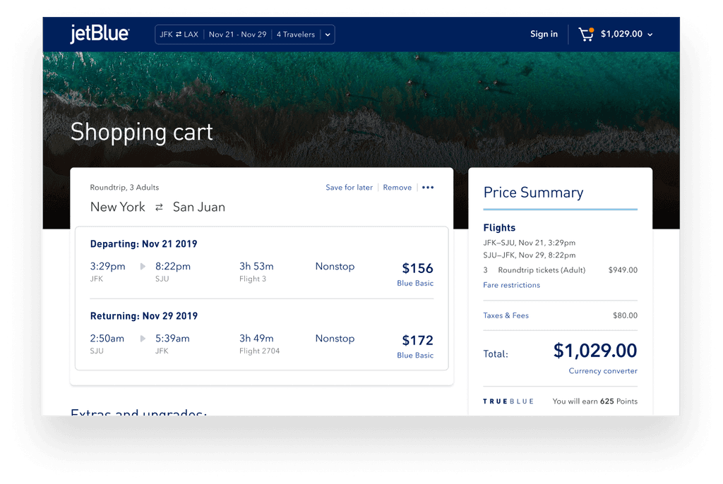
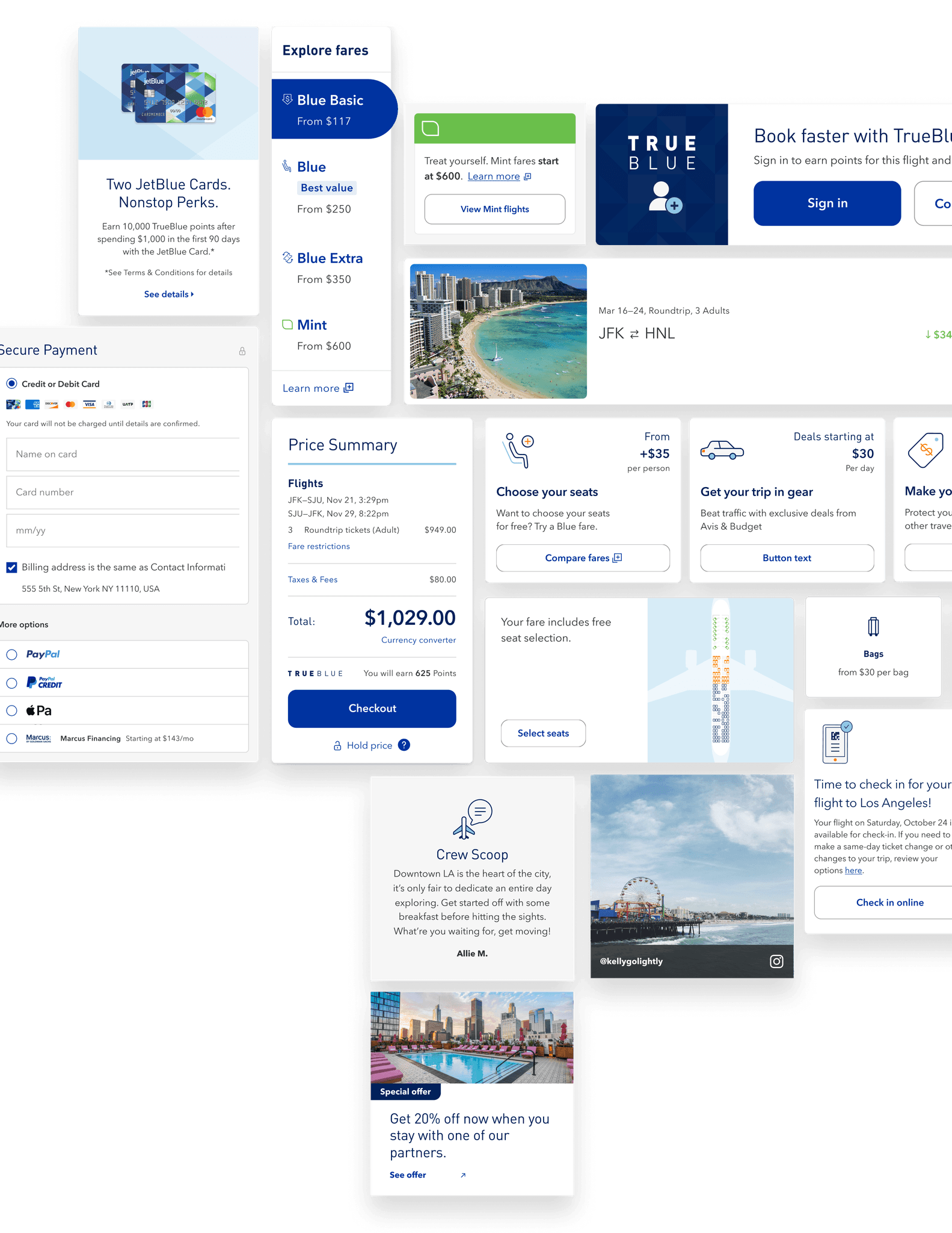
Shopping cart
Makes it easy for users to book now or save for later.
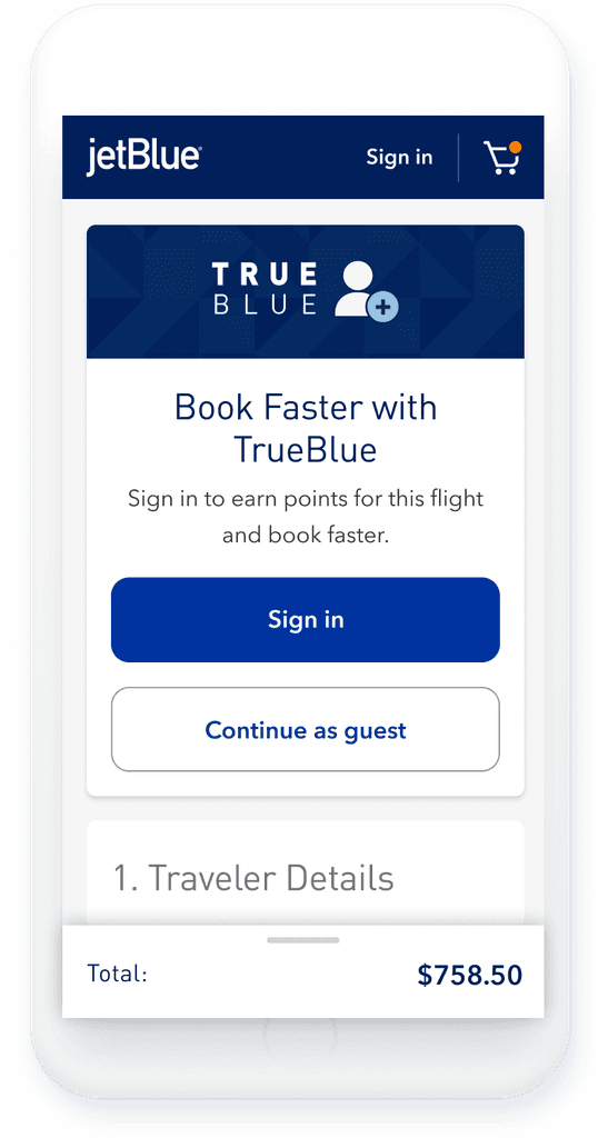
Checkout
A more seamless path to completion. Reducing cognitive load minimized friction and improved recognition, leading to fewer drop-offs and higher conversion.
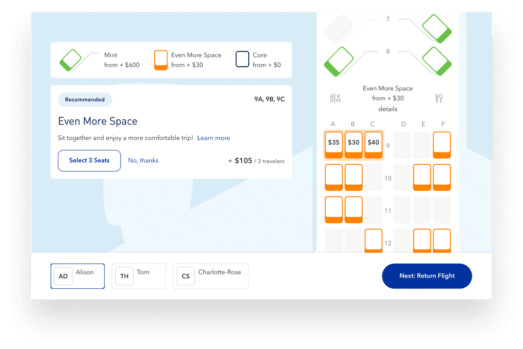
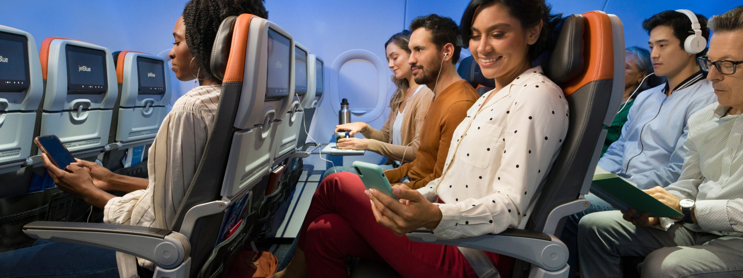
Seat selection
An immersive way to select your seats that upsells that responds as the customer scrolls through different segments.
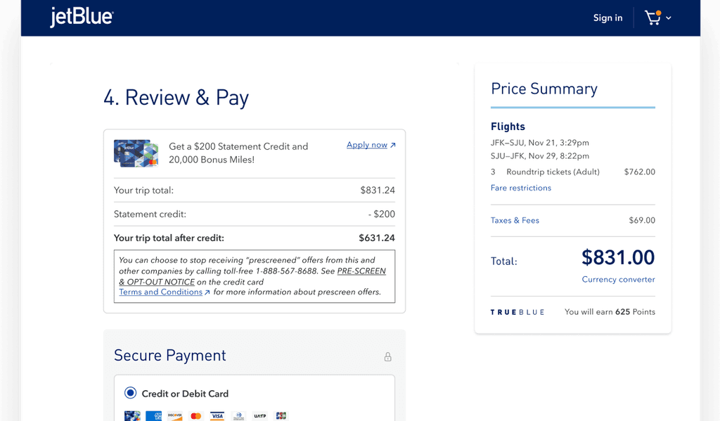
Payment and Confirmation
Enables JetBlue card upsells, flexible payments, and travel credit use—reinforcing reward and trip control in one place.

" height="2.1187359513420594px" id="P5kIJB7Ko" transform="translate(4.268 0)" width="11.73219480873486px"/><path d="M 2.13 11.637 L 0 11.637 L 0 0 L 2.13 0 Z" fill="rgb(15, 14, 14)" height="11.636652122173734px" id="xBplekXaY" transform="translate(13.87 0)" width="2.1296344887445002px"/><path d="M 1.509 14.942 L 0 13.447 L 13.563 0 L 15.073 1.496 Z" fill="rgb(15, 14, 14)" height="14.94221869628454px" id="DEz5S9WYM" transform="translate(0 1.058)" width="15.072818848944806px"/></g></svg>)