
JetBlue
Born at JFK in 1999, JetBlue is now a global, award-winning travel company.

Discipline
Product, Brand
Team
UX Director, ECD, 2 design leads, 2 squads UX/UI, product manager, producers, account management, product owners,
5 initiatives
Work produced at Big Spaceship as Design Lead
Deliverables
Vision and strategy, UX and design audit, competative analysis, user testing, information architecture, visual design, prototypes design System
Client
JetBlue

THE CHALLENGE
Redesigning the booking experience
To redesign the customer end-to-end booking experience online. Implement responsive web design and e-commerce best practices. Reinventing how customers purchase travel, by reducing the number of decisions.
Business value: To increase booking conversion.

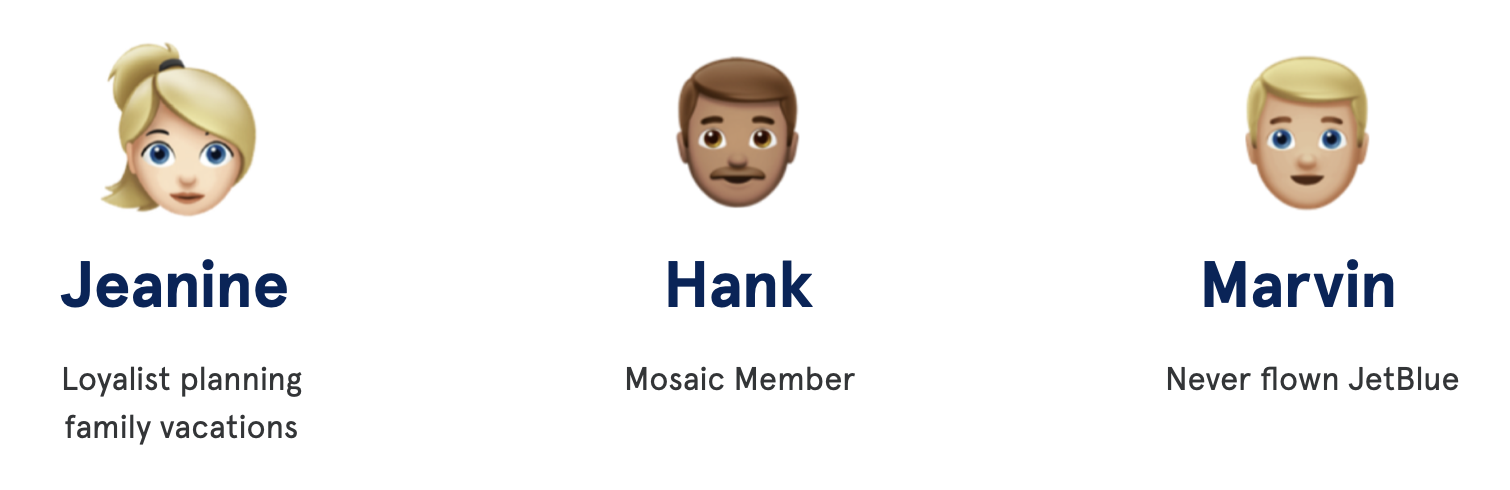
Personas
The project was seen through the lens of 3 different personas.
Design decisions made were based on their motivations to help personalize the experience.
THE SOLUTION
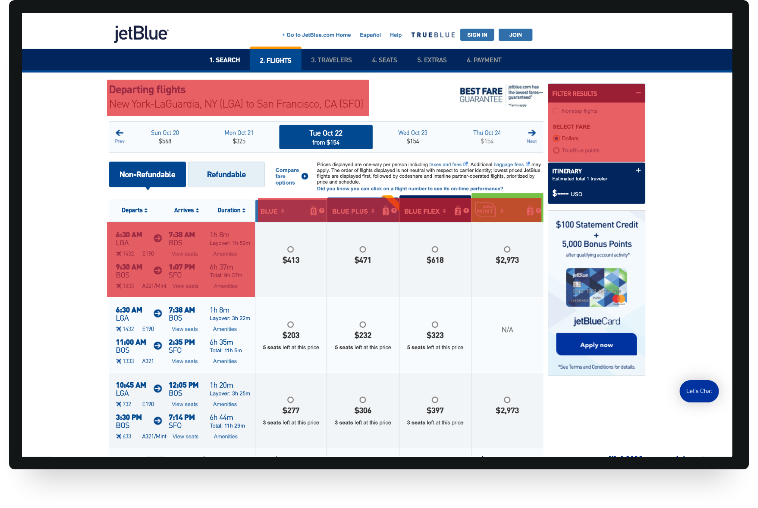
Flight Results
Flight results was optimized to include overall UX best practices. Through research and observing recorded videos of customers using the platform (Full story) we were able to get more insight and create a streamlined experience. Below is the legacy system and some highlighted painpoints.
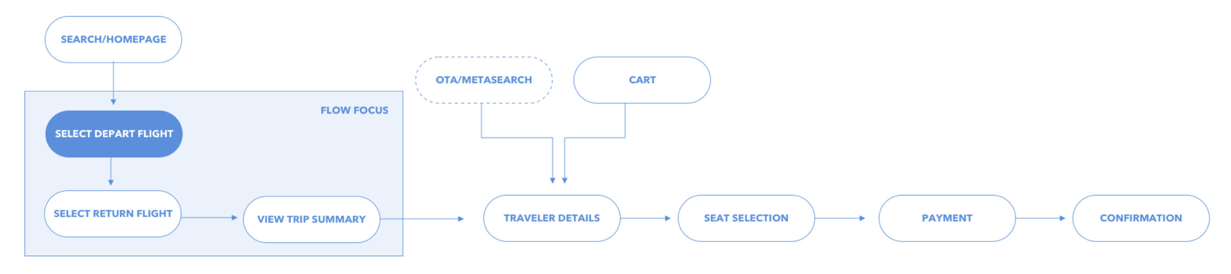
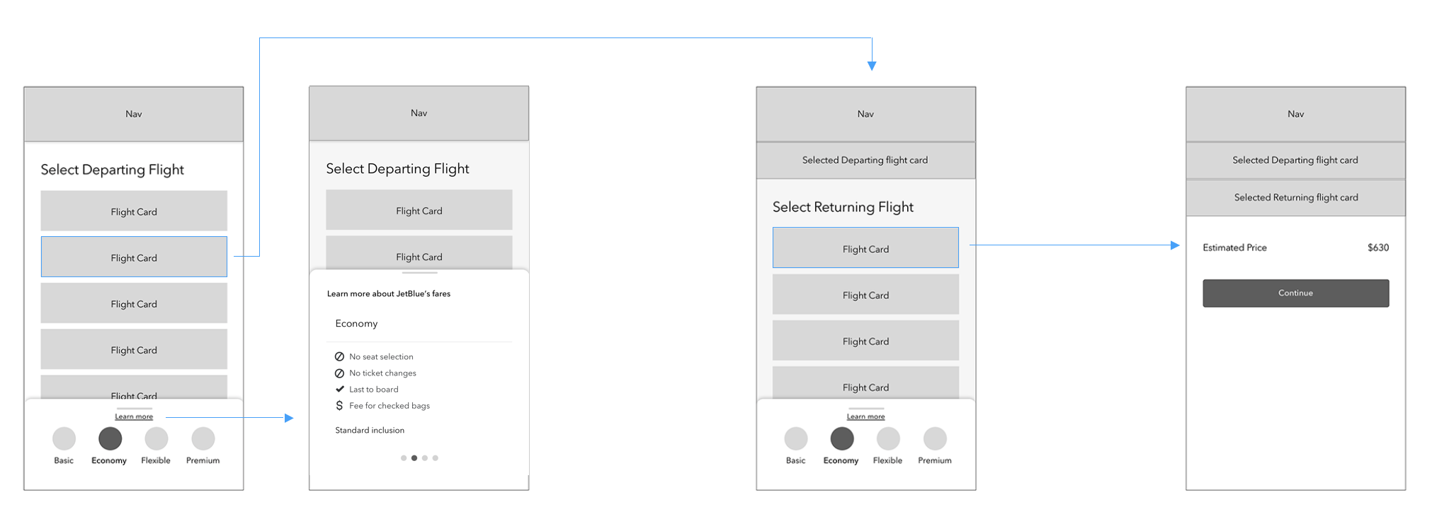
The top-level flow of how a user would funnel through the booking experience. A user can enter through the homepage or enter through an OTA (online travel agency, kayak, google flights)
12 qualitative and 50 quantitative mobile first tests were conducted to learn which of the two UX flows were the most usable for customers. We wanted to learn:
• Are customers able to understand the differences in fare classes?
(Blue Basic, Blue, Blue Extra and Mint)
• Does each fare class treatment provided clearly explain benefits and inclusions?
• Do users have enough information to understand if it suits their needs?
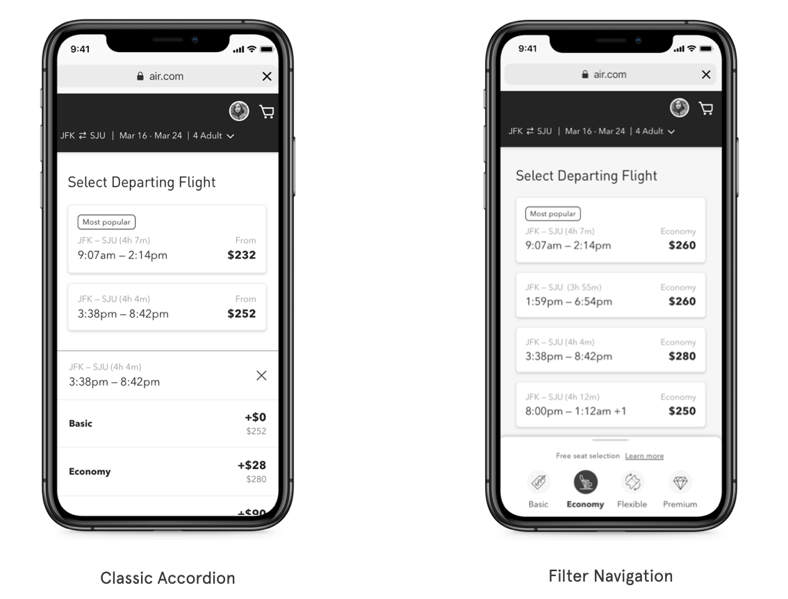
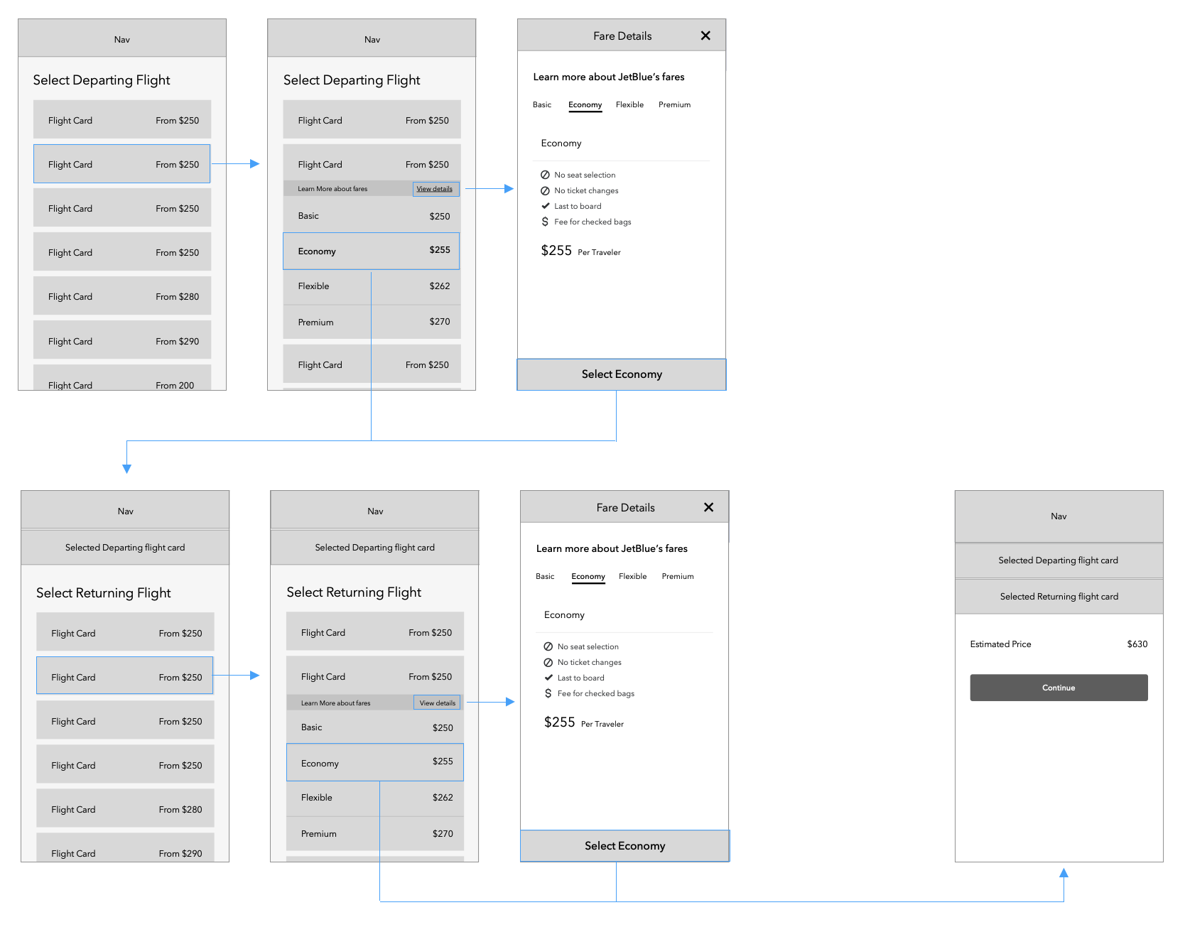
UX Direction 1
Classic Accordion
UX Direction 2
Filter Navigation
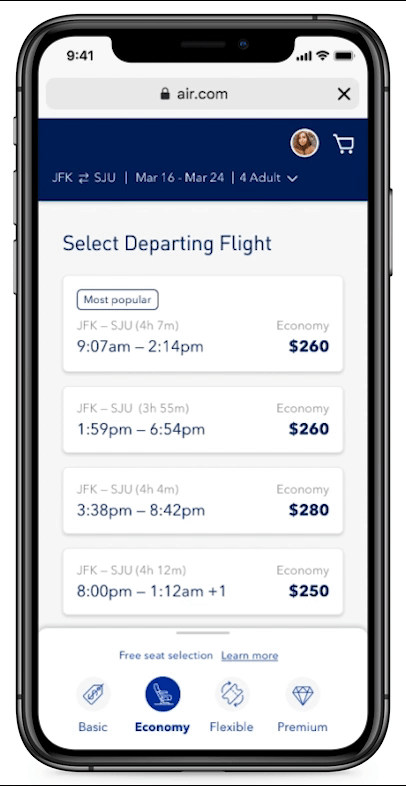
Insights from user testing
Filter navigation was the preferred UX design direction among users
• Offered the ability to compare price changes and understand what each fare class offered simultaneously
.
• Customers were able to learn more about each fare in context to how they navigated the screen, keeping customers oriented.
• Customers described it as “clean”, “concise”, “easy to navigate” and “efficient”.
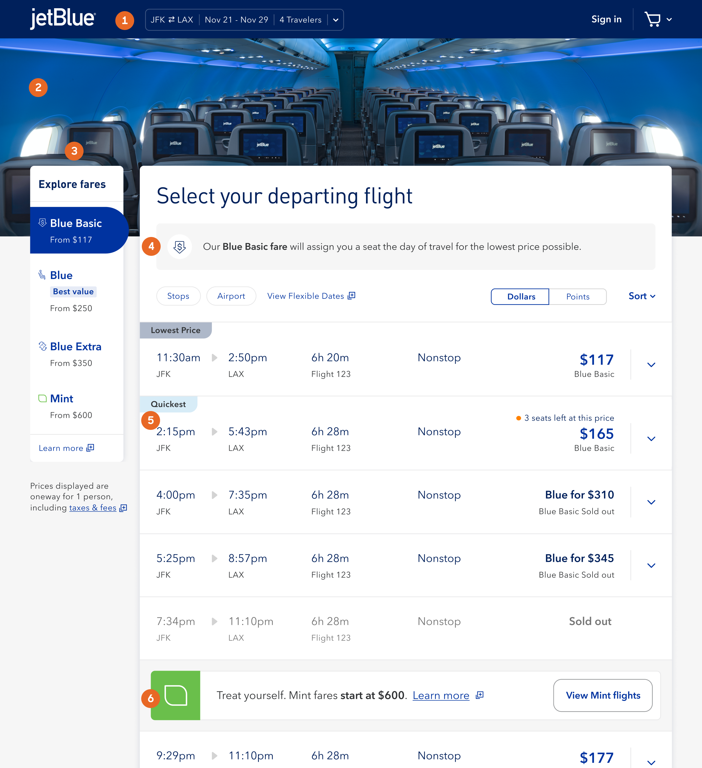
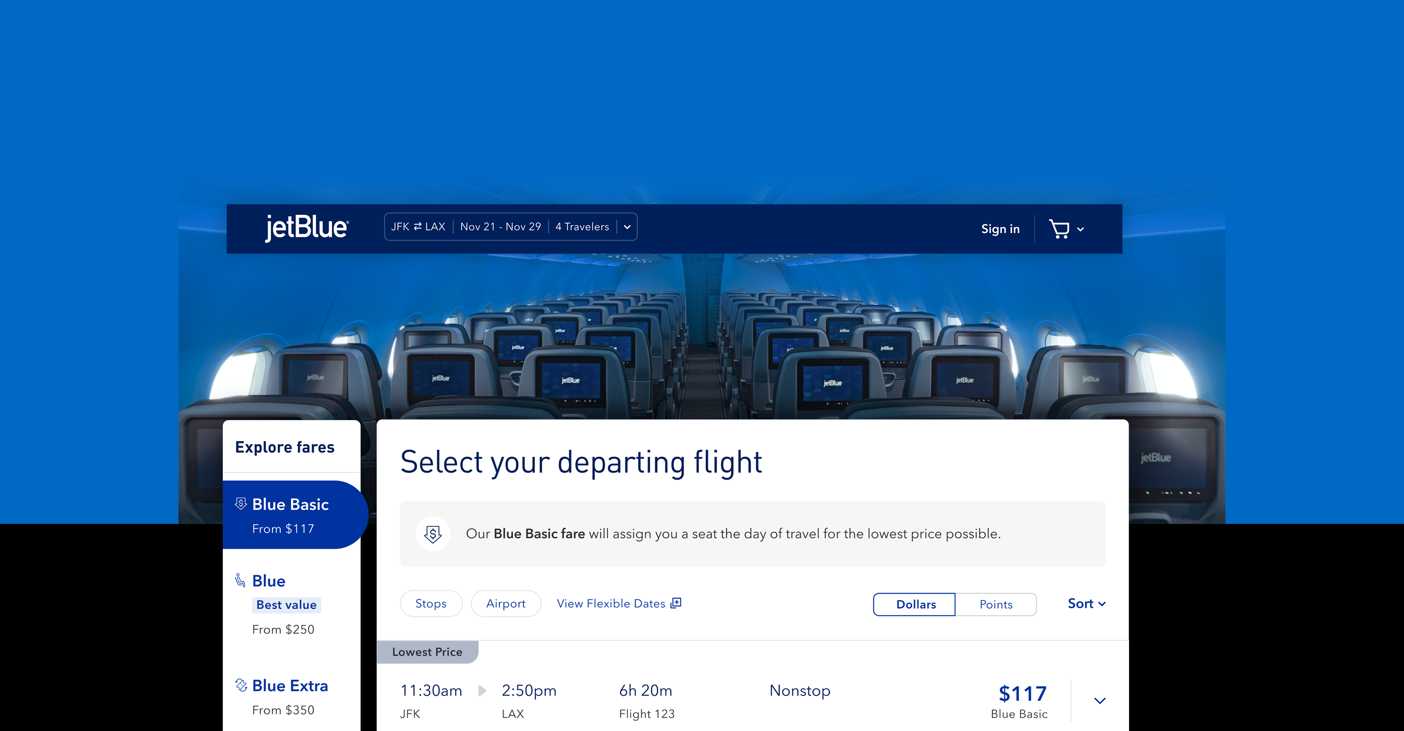
Flight Results UX improvements
1. Persistent Booker - Allows users to access and change flights quickly and easily within the flow
2. Hero Marquee - Visual interest / branded moment
3. Filter navigation (Filter panel) - From price / lowest price allows users to compare fares and choose what’s right for them
4. Value props for fare class - explanation allowing users to know what class they are on
5. Flight card details - We streamlined content and flight information easier to read and implemented, Flight tag recommendations
6. Fare upsells - Mint mode. A module to get users to upgrade and spend more!
Other features in the experience
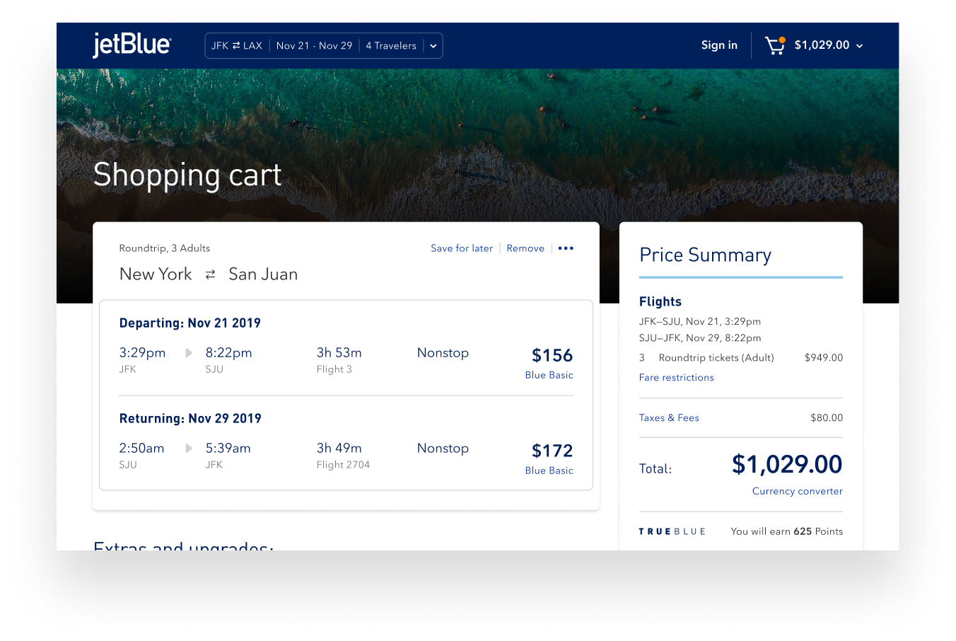
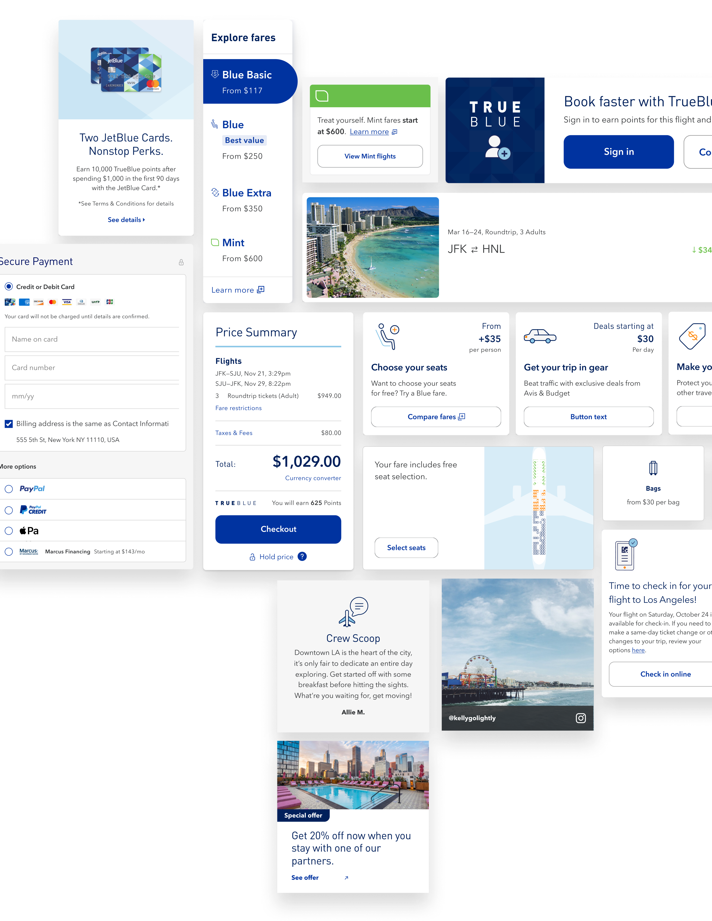
Shopping cart
This feature makes it easy for user to book now or save for later.
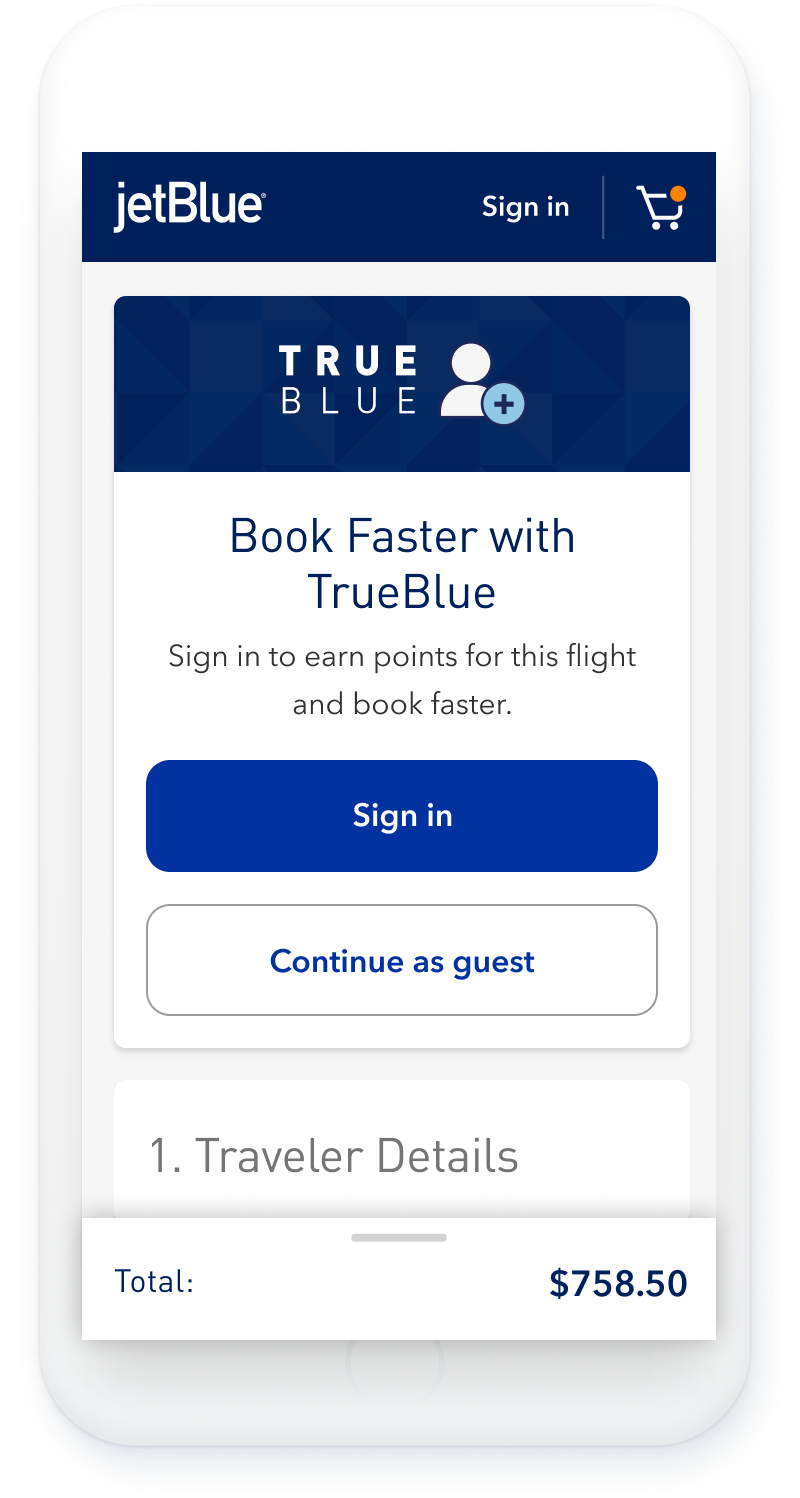
Checkout
A more seamless way to get through to the finish line. The reduction of cognitive load played a massive part in providing users with a less friction experience. By providing ways to recognize them and earlier reduced purchase abandonment.
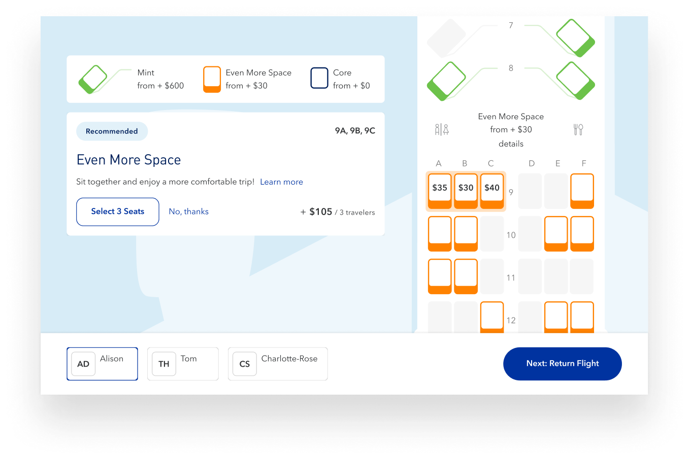
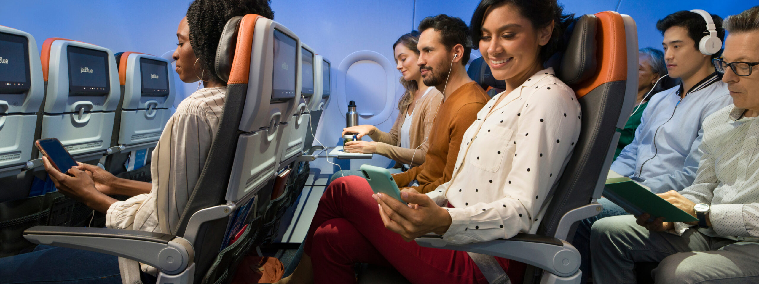
Seat selection
An immersive way to select your seats that upsells that responds as the customer scrolls through different segments.
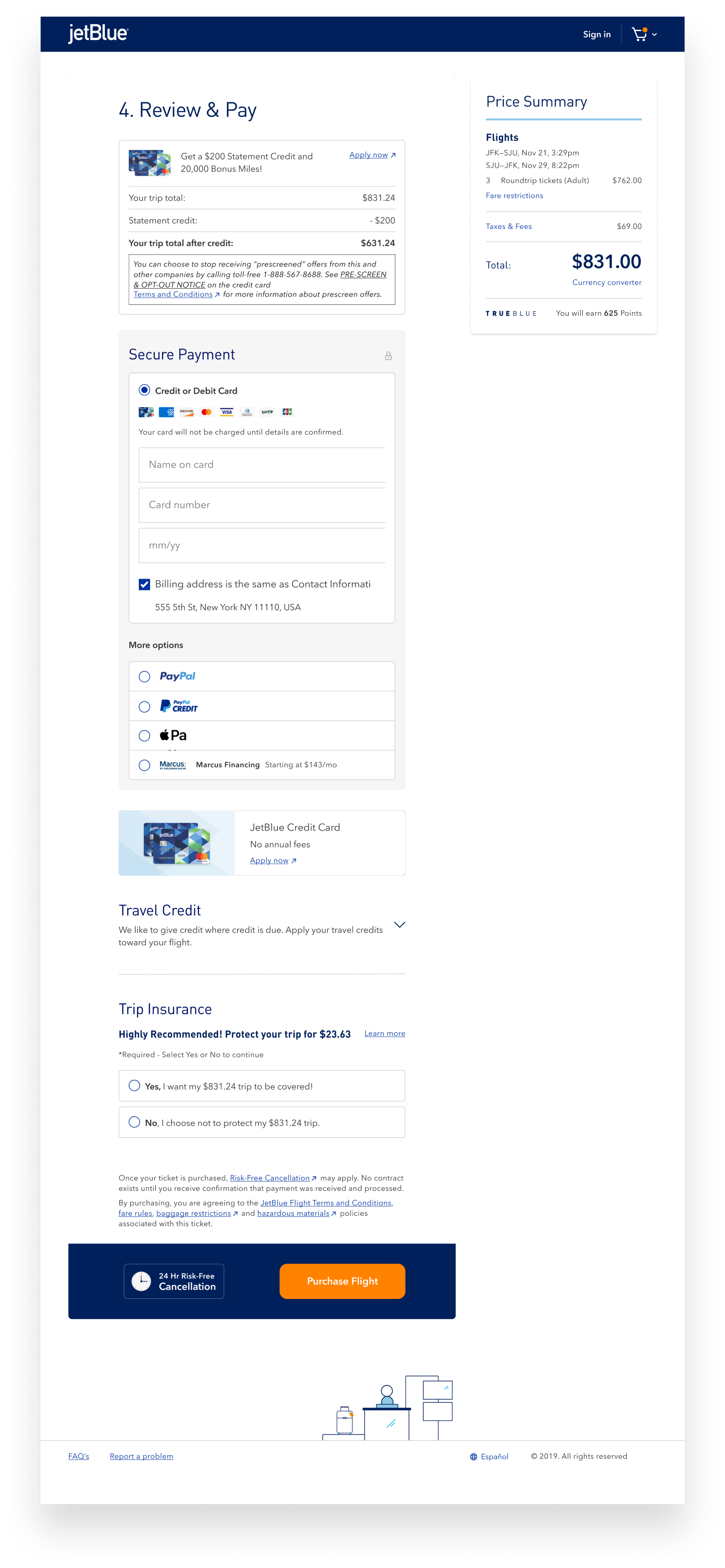
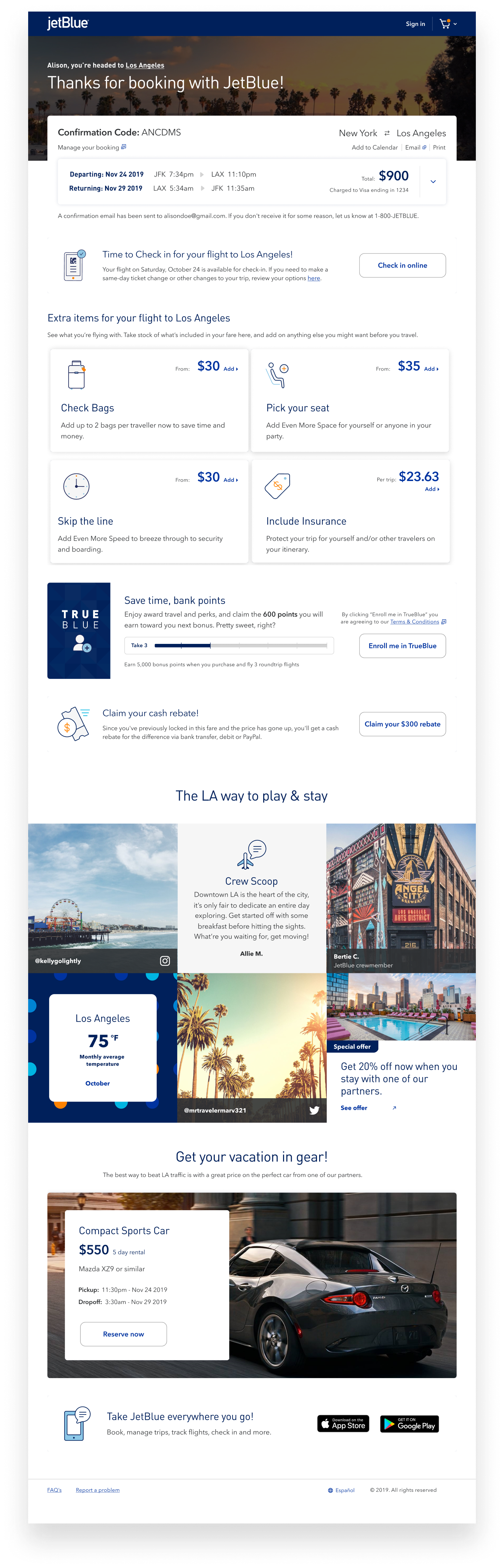
Payment and confirmation
We cleaned up payment and made the process much more seamless, allowing for JetBlue credit card upsells, options for payment methods, and travel credit. Confirmation gave a sense of reward to the user and the ability to manage their booking all from one place.
Metrics of success
& improvements
■ Increase booking conversion
■ High engagement for Trueblue
(Loyalty Program)
■ Finding branded moments that are ownable
■ Scalable system

Contact me for new and exciting opportunities and collaborations.
© Cesar Corpus 2023