
BlockFi
A platform that redefines the future of banking where users can earn interest, borrow cash, and trade crypto from financial services providers.

Discipline
UX and Product
Feature Squads
Onboarding
Payments Fiat & Crypto
App Redesign
Team
Product Manager
Engineering (FE & BE)
Research
Content Strategist
QA


THE CHALLENGE
Streamline the onboarding process
Clients today experience onboarding as “a necessary evil” to endure vs an experience that supports their investment goals. Users have to go through over 20 screens before they can even add money to the platform.
Business value:
Increase # of clients who can immediately begin using our services.
- Drives 925K new accounts.
- Add $1.5M in revenue for newly acquired US clients.
- Save $76,000 on FTE headcount for manual KYC reviews by decreasing # of manual workflow events.
- Estimate 10%+ increase in conversion for US.
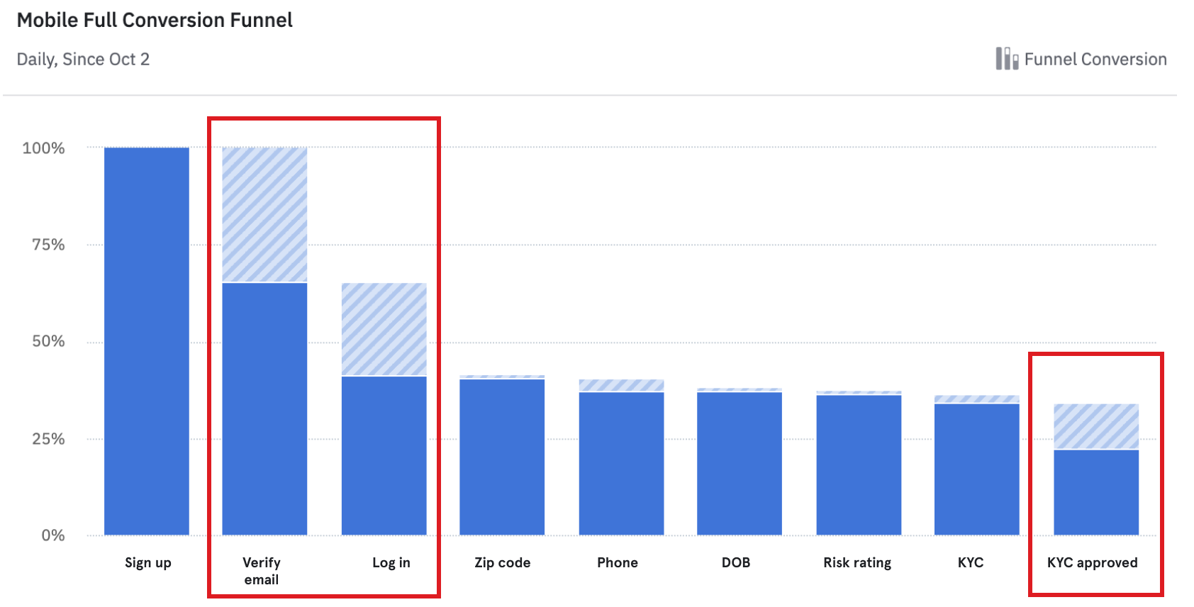
Where is the drop-off?
What are the customer pain points?
Invasive
“Invasive as hell. They want to know everything about me before I could even browse the app. Felt like it was a cult leader or the DMV questioning me.”

KYC failure
“I tried many times to complete my KYC but every time it got unsuccessful. Now it’s telling me that it can’t offer our services. What a useless app.”
KYC failure
“I can’t even get an account started. I tried 8 times to scan my Drivers License to prove that I am a legal human being...Moving on to another platform.”
THE APPROACH
Experience deep dive
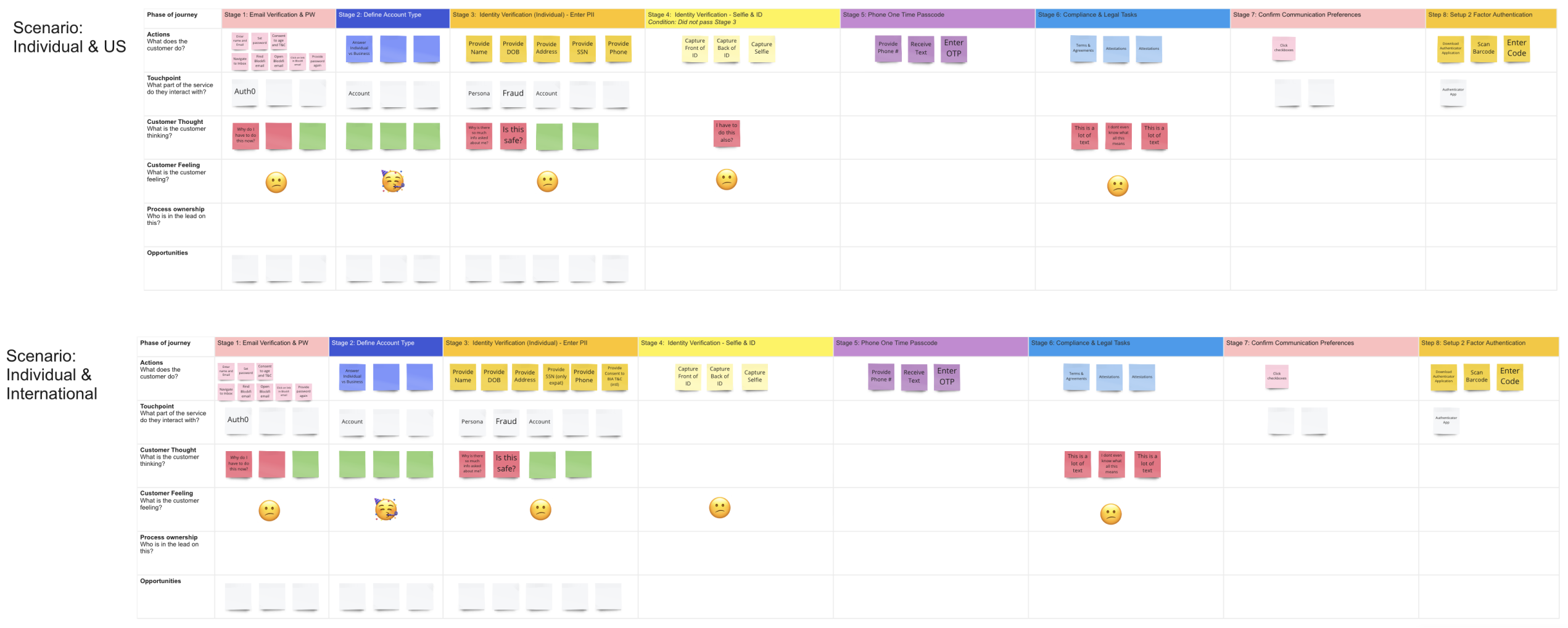
To overhaul the onboarding experience, I started by completing a full UX audit, scrutinizing every screen and taking note of potential opportunities for improvement.
I worked closely with product managers and engineers to develop a detailed map documenting all the different touchpoints in the customer journey. This overview provided the necessary clarity for our team to make important strategic decisions. Syncs with engineering were crucial to understanding any constraints and what’s technically feasible within the timeline.

THE SOLUTION
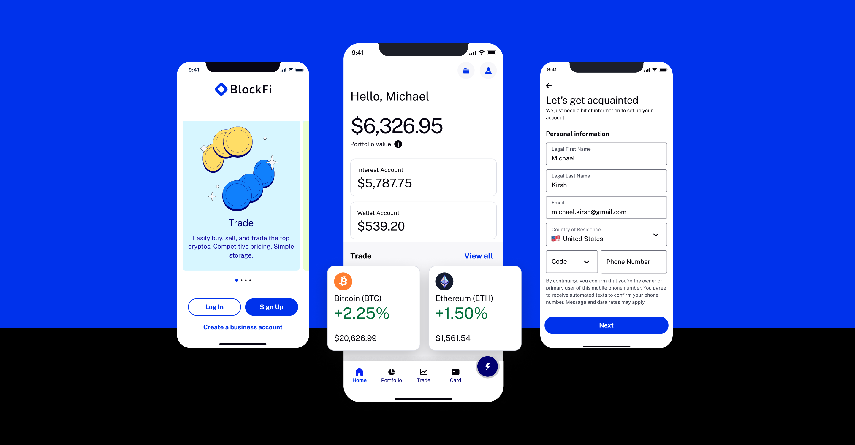
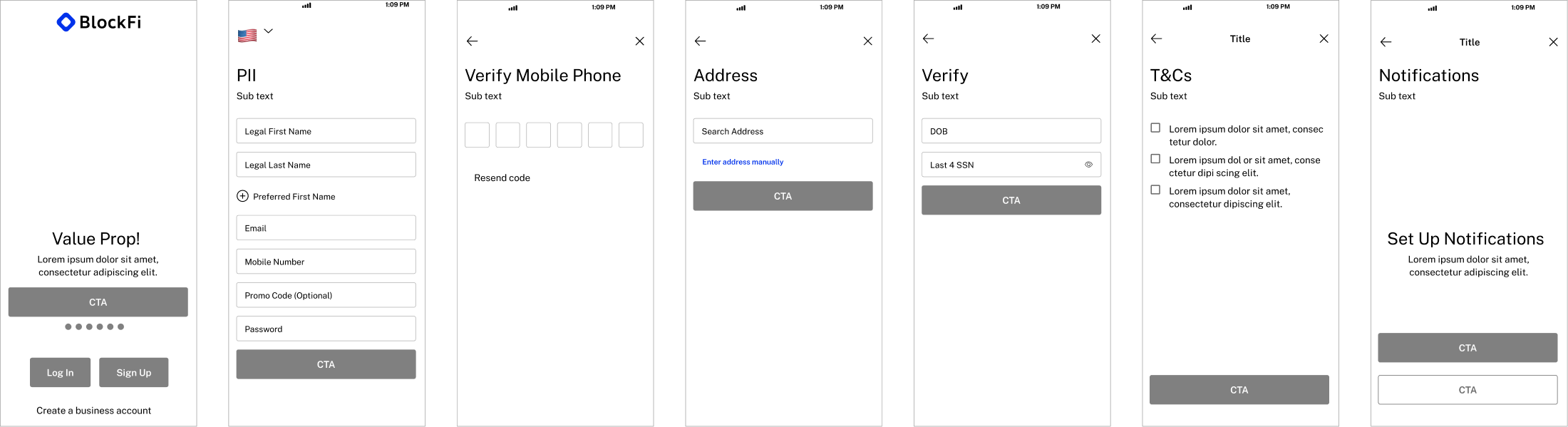
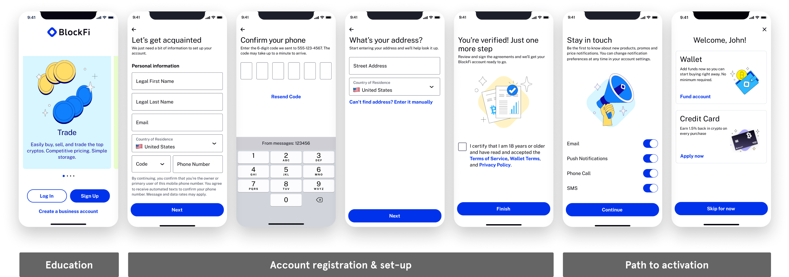
Architecting a new future - The happy path flow
The end results was an easy, quick, streamlined, personalized experience that set clients up for success (and hints at the next action) by only asking for necessary info, using geo-location, and prefilled form fields all helped convey the value of the process. By overhauling onboarding for web and mobile applications,
it enabled a 66% decrease in # of pages/form fields required and an improvement in KYC coverage and accuracy of new data partners.
Improvements
• The splash screen is a moment to educate the user. I wanted to make sure clients understand the value props around our different products and features Ex. Trade, Loans, Earning, and Investing.
• All major identifiers (PII) are on the initial page allowing more time for background verification and fraud checks: Full name, email, and mobile.
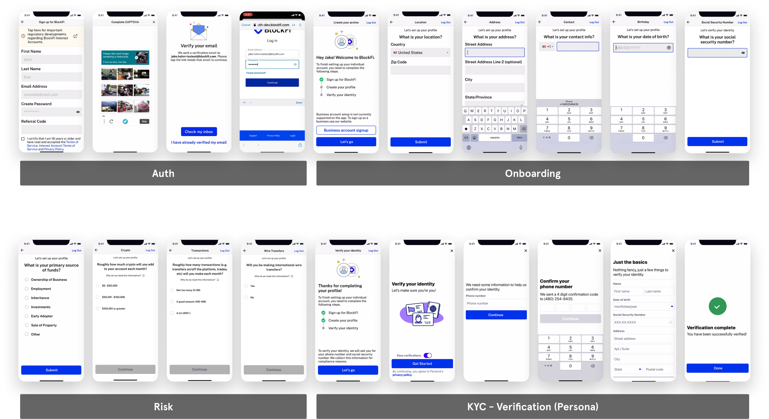
• Offloading the address to its own page gives more breathing room and doesn’t interfere with other questions or overwhelm.
• Consolidated T&Cs to own page for a final declaration of action.
• Buttons hug content, making them more reachable by thumb.
Unhappy Path
By replacing Persona and integrating with 3rd party vendors, Telesign, Lexisnexis, and Sentilink, our verification process becomes more seamless and in the background with the outlook of only having 10% of users going through the unhappy path of further verification.


Insights from user testing
The experience was considered standard by most participants and the length of the flow was as expected for most participants.
• No major usability or comprehension challenge was observed.
• Those who had concerns about providing SSNs called out that trust in the platform is a key factor when deciding whether to provide the info or not.
The goal of onboarding is to get clients on the platform, integrated, and using the products as soon as possible. It can be deduced and confirmed that since were no usability or comprehension issues, and the flow was cut down by more than half, the original screens were a massive friction point for users and deemed unnecessary for the user.
Since Trust was a point users called out during testing we added a Trust value prop to the carousel on the splash screen.
Other features in the experience
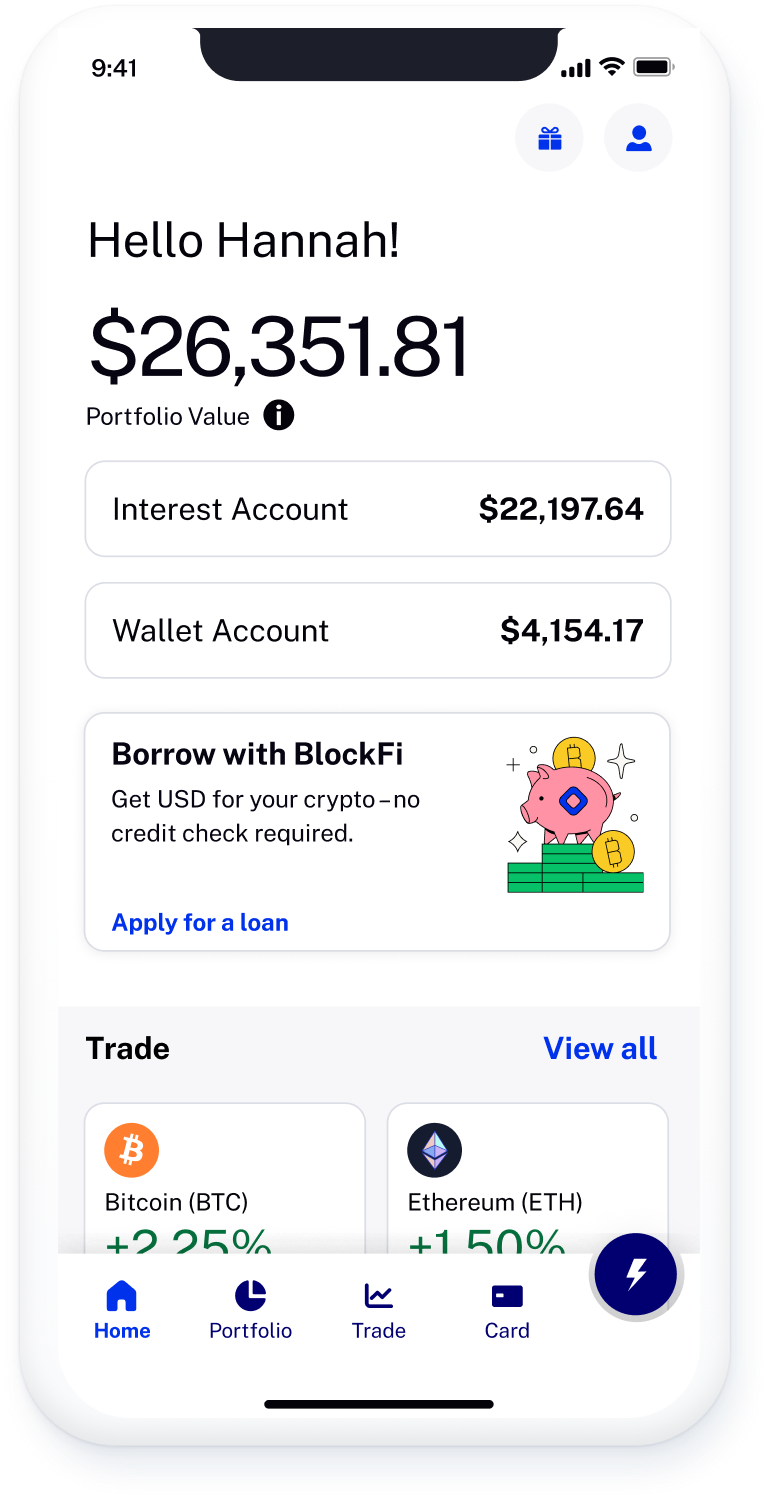
Home redesigned
A snapshot of a client’s account health with personally relevant information, quick actions, and suggestions for the next best actions; informs new clients of what BlockFi offers to drive activation & engagement.
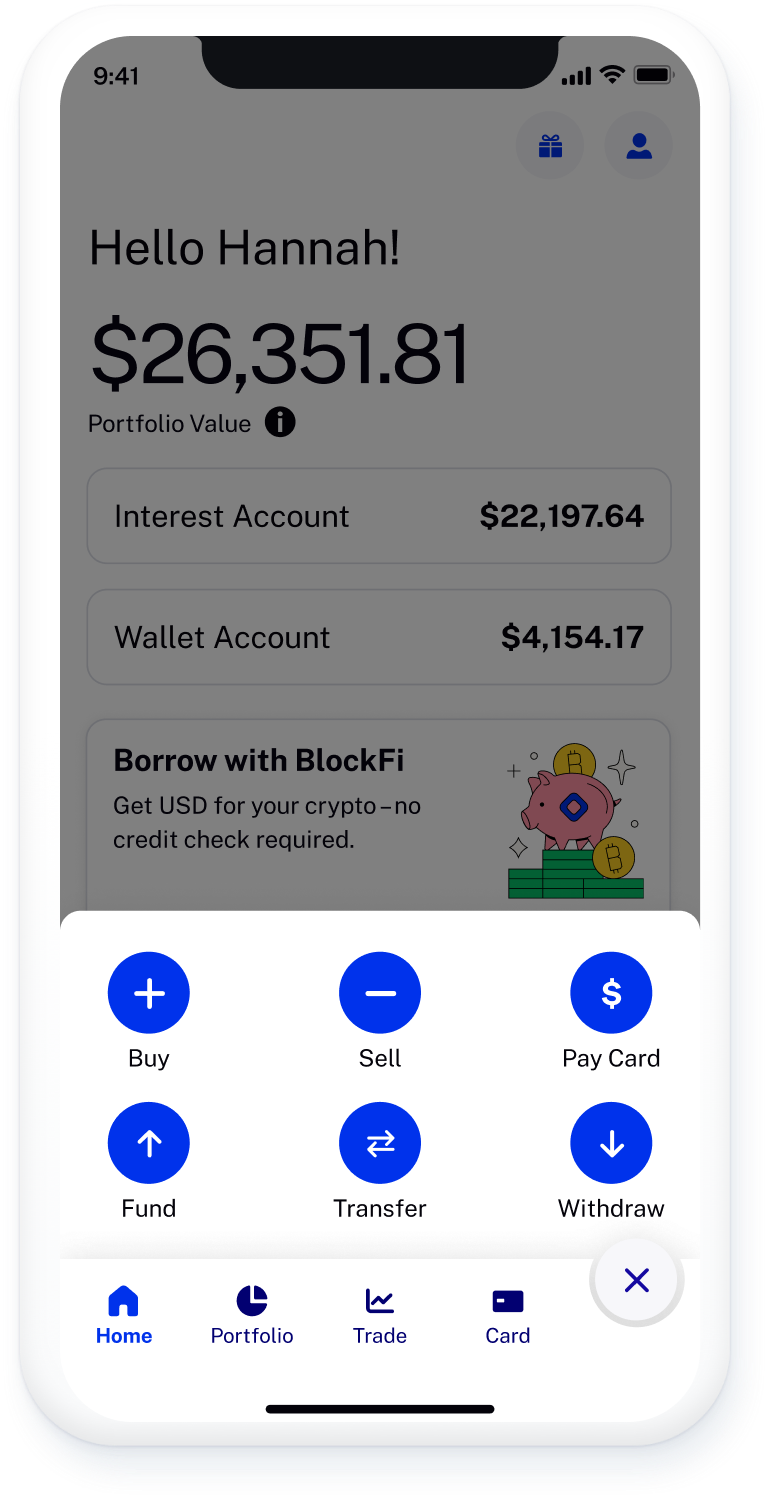
Quick Actions
Easy access to most relevant actions from anywhere in the app.
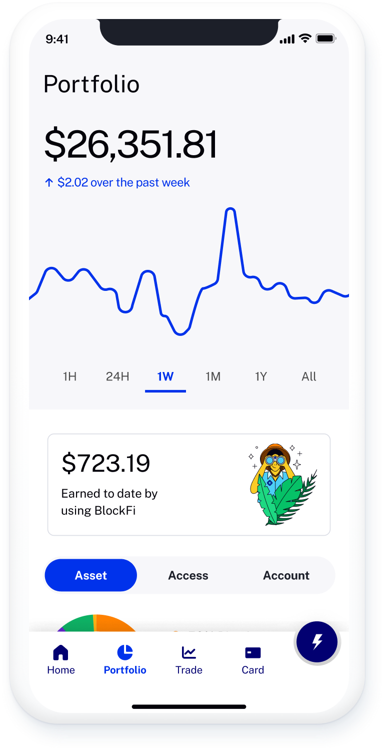
Portfolio
An overview of the client’s crypto assets where they can see cross-portfolio data, and drill down into specific balances for more detailed info that will inform key actions.
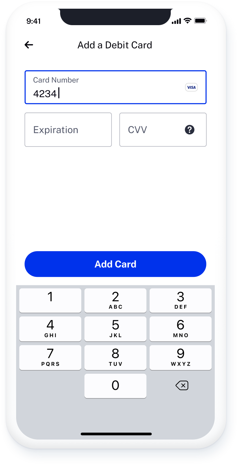
Debit Card - Stripe Integration
Allowing international clients purchase stablecoin on the platform, faster through the use of their debit card.
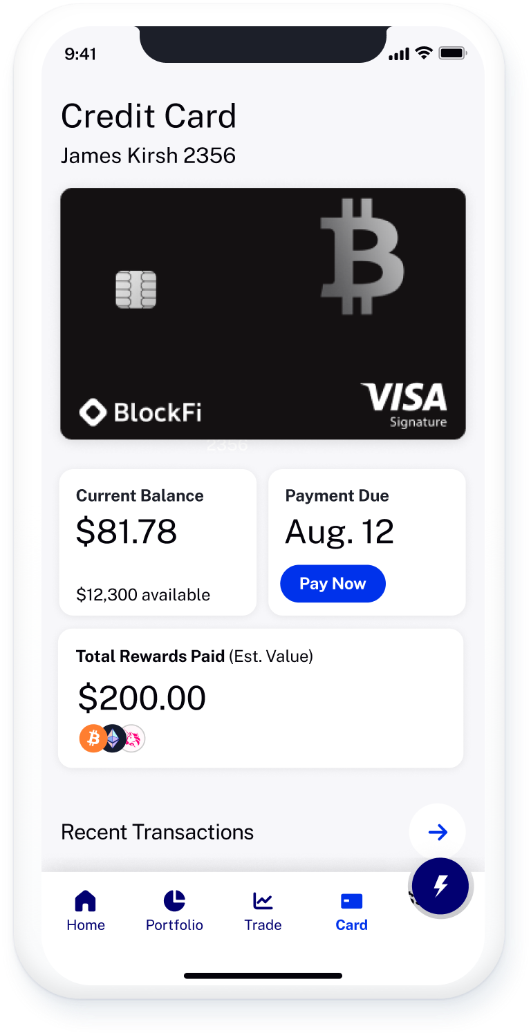
Credit Card
Overall health snapshot of a client's credit card information. The screen is easy to scan with key info including (Current balance, Pay due, and Rewards tracking).
Metrics of success & improvements
Efficiency
■ Decrease number of pages and required fields.
KYC Success
■ Improve coverage and accuracy w/new data partners.
Conversion
■ 10%+ increase in conversion for US customers.
Revenue
■ $1.5M in additional revenue for newly acquired US clients.
Operational
■ Headcount savings by removing manual kyc review.

Contact me for new and exciting opportunities and collaborations.
© Cesar Corpus 2023